
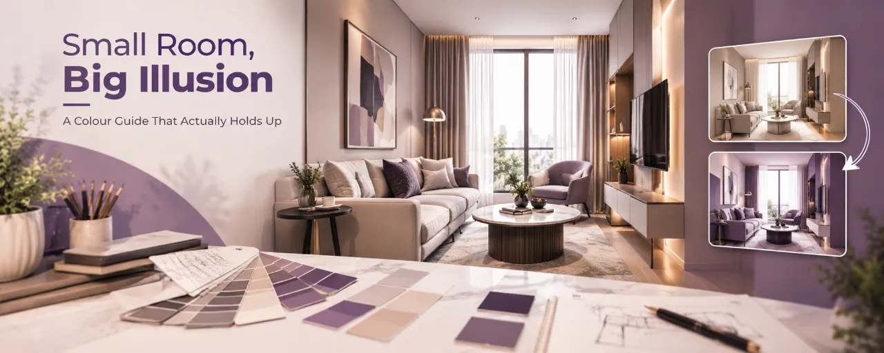
Small Room, Big Illusion: A Colour Guide That Actually Holds Up
Everyone knows the advice: paint a small room white and it'll look bigger. It's not wrong, exactly, but it's also not the whole story, and following it blindly can leave a small room looking sterile rather than spacious. The real mechanics behind colour and perceived size are more specific than “light good, dark bad,” and once you understand them, you can make choices that feel intentional rather than default.
Here's what actually works, and why.
- Why colour changes how big a room feels
- The palette that actually works
- Where the myth oversimplifies: dark colours aren't always the enemy
- The ceiling is doing more work than you think
- Sheen matters as much as shade
- Room by room
- Colour doesn't work alone
- Common mistakes to avoid
- Frequently asked questions
Why Colour Changes How Big a Room Feels
A room's actual size doesn't change. What changes is how your eye reads its boundaries. Light colours reflect more light and blur the line between wall and ceiling, so the eye doesn't register a hard stop, which reads as more space. Dark colours absorb light and pull surfaces visually closer, which can make a wall feel nearer than it is. Neither effect changes the room's dimensions, but both change how your brain estimates them, which is genuinely half the experience of a room.
The Palette That Actually Works
Soft, Warm Whites & Off-Whites
Not stark, clinical white, which can feel cold and flat under artificial light, but a warm white with the faintest hint of cream or grey. This keeps the room feeling light without feeling like a hospital corridor.
Pale, Muted Pastels
A very soft sage, a dusty blue, a pale blush, each of these behaves almost like a white in terms of light reflection, while adding warmth and personality that pure white lacks. The key word is muted, a saturated version of the same colour behaves completely differently.
Cool, Airy Tones for Low-Light Rooms
In a room that gets very little natural light, a very pale cool tone, a soft ice blue or a pale grey-green, can visually compensate for the lack of warmth in the light itself, making the space feel brighter than a warm white would in the same conditions.
Monochrome Tone-on-Tone
Painting walls, trim and even the ceiling in closely related shades of the same colour removes the visual “stop” your eye would otherwise register at each boundary, making the whole room read as one continuous, larger volume.
Where the Myth Oversimplifies: Dark Colours Aren't Always the Enemy
A single dark accent wall, especially opposite the main light source, can add depth and make a small room feel intentional rather than cramped, as long as the rest of the room stays light to balance it. The mistake isn't dark colour itself, it's dark colour used without contrast, on every wall, with no lighter surface to balance it. A fully dark room without adequate lighting will feel smaller, but a lighter room with one deliberate dark element can feel curated and spacious at once.
The Ceiling Is Doing More Work Than You Think
Painting the ceiling the same colour as the walls, or a slightly lighter version of the same shade, removes the visual line between wall and ceiling entirely, which is one of the single most effective tricks for making a room feel taller and larger. A stark white ceiling against a coloured wall, ironically, can make a low ceiling feel even lower by drawing a hard line across the room.
Sheen Matters as Much as Shade
| Finish | Effect | Best used for |
|---|---|---|
| Matte / Eggshell | Diffuses light softly, hides minor wall imperfections | Calm, spacious-feeling bedrooms and living rooms |
| Satin / Semi-Gloss | Reflects more light, genuinely brightens a room | Well-prepared, smooth walls; kitchens and high-use areas |
| High Gloss | Can create glare and reflections under artificial light | Small accents only; use sparingly in small rooms |
Room by Room
Bedrooms
A pale, warm neutral or a muted pastel works well here, paired with a ceiling in the same or a lighter tone. Avoid strong contrast between wall and ceiling in a room where you're often lying down looking directly up at it.
Living Rooms
A slightly cooler neutral can help if the room gets strong afternoon sun, balancing the warmth of the light itself. This is also the best room for a single deliberate dark accent wall, since it's viewed from a distance and benefits from a sense of depth.
Kitchens
Light, easy-to-clean satin finishes in soft neutrals keep a compact kitchen feeling open, while a fully white kitchen can start to feel clinical without any warmth introduced through cabinetry or accessories.
Bathrooms
Pale, cool tones paired with good lighting and a large mirror do the most work here, since bathrooms are usually the smallest, most enclosed rooms in a home.
Colour Doesn't Work Alone
Colour is one lever, not the whole answer. It works best paired with:
- Good, layered lighting, since even the best colour choice will look muddy under a single harsh overhead bulb
- Minimal visual clutter on walls, since a light wall covered in mismatched frames loses much of its spaciousness effect
- Furniture that doesn't compete, choosing pieces close to the wall colour rather than in sharp contrast keeps the room feeling continuous
- Reflective surfaces, a well-placed mirror amplifies whatever colour and light effect you've already created
For storage-related ways to keep a small room feeling open, see the small bedroom storage guide.
Common Mistakes to Avoid
- Choosing a stark, cold white expecting it to automatically feel spacious, then finding it feels flat and uninviting instead
- Painting every wall a different accent colour, which visually chops up a small room rather than opening it
- Ignoring the room's actual light direction and orientation when choosing undertones
- Pairing a light wall with heavy, dark furniture or curtains that cancel out the effect
- Choosing high-gloss finishes on uneven or poorly prepped walls
The Professional Judgement: Colour Is a Tool, Not a Magic Fix
No colour will make a room physically larger. What the right colour, sheen and ceiling treatment can genuinely do is change how the eye reads the room's boundaries, and that's a real, usable effect, not just a decorating myth. Choose based on your room's actual light, pair it with the right sheen and lighting, and treat one deliberate dark element as an asset rather than something to avoid entirely.
For monsoon-specific paint and finish considerations in humid climates, see the WallsToWonder design ideas collection.
Use AI Before You Meet an Interior Designer
AI tools can help you organise your ideas before meetings. They are not a replacement for professional design judgement.
Estimate Your Budget
Create an initial interior budget based on your requirements.
Estimate Interior Cost →Check Your Quotation
Review an interior quotation and identify areas that may need clarification.
Check Quotation →Discover Your Style
Explore which interior design direction may suit your preferences.
Find Your Interior Style →Planning a Colour Scheme for a Small Room?
Take your room's light direction, photos and questions to designers serving your area. Explore interior professionals, review their work and use WallsToWonder's planning tools before you commit.
Explore Interior Designers Estimate Your Budget Explore Design IdeasFrequently Asked Questions About Colours for Small Rooms
What colour makes a small room look bigger?
Soft, warm whites, pale muted pastels and cool airy tones in low-light rooms all work well. The effect comes from how much light the colour reflects and how closely the ceiling and trim match the wall colour, not from any single “correct” shade.
Should I avoid dark colours in a small room entirely?
Not necessarily. A single dark accent wall, balanced by lighter surfaces elsewhere in the room, can add depth without making the room feel smaller. The mistake is using dark colour on every wall without balance or adequate lighting.
Does the ceiling colour actually matter for making a room look bigger?
Yes, significantly. Painting the ceiling the same or a slightly lighter shade than the walls removes the visual line between them, which is one of the most effective tricks for making a room feel taller and larger.
What paint finish is best for a small room?
Matte and eggshell finishes diffuse light softly and hide wall imperfections. Satin and semi-gloss reflect more light and can brighten a room further, but need a well-prepared, smooth wall to look good.
Can WallsToWonder help me choose a colour scheme for my room?
Its tools can help you visualise a room and explore design directions, but colour decisions are best confirmed with a designer who can assess your room's actual light and orientation in person.
Final Checklist Before You Pick a Colour
- Have you checked how the shade looks in your room's actual light, at different times of day?
- Is your ceiling colour matched or close to the wall colour?
- If using a dark accent, is the rest of the room kept light to balance it?
- Have you chosen a sheen suited to the wall condition and room type?
- Is the lighting layered, not relying on a single harsh overhead source?
- Does your furniture and curtain colour support the wall colour, rather than fighting it?
Colour is a genuinely powerful, low-cost tool for a small room, as long as it's chosen with the room's real light and layout in mind. Use WallsToWonder to explore interior designers, plan your interior budget, review your quotation and discover interior design ideas before taking the next step.
Turn this idea into a plan for your home
Visualise your space, understand the likely budget, or find a professional who can bring the idea to life.