
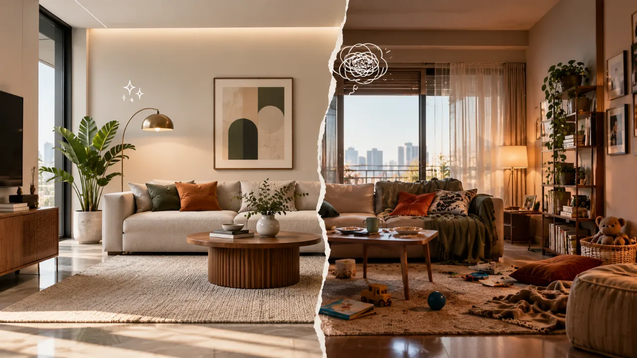
When Modern Homes Feel Too Perfect: What Goes Wrong
Modern interiors are often associated with clean lines, elegant finishes, uncluttered surfaces and carefully selected furniture.
But there is a point where “polished” starts feeling “staged.”
The problem is not modern design itself. The problem is designing only for the photograph and forgetting the person who has to live there.
- Making everything match
- Choosing furniture for appearance alone
- Removing personality
- Using only hard surfaces
- Making lighting too dramatic
- Treating empty space as the goal
- Using the same colour everywhere
- Making every piece look brand new
- Ignoring scale and proportion
- Creating a perfect seating arrangement
- Hiding every practical element
- Treating plants as an afterthought
- Copying a showroom instead of understanding the idea
- Forgetting the messy parts of real life
- Overusing statement features
- Making the home too symmetrical
- Choosing materials without considering touch
- Designing for one photograph
Mistake 1: Making Everything Match
One of the easiest ways to make a home feel staged is to make every element look like it belongs to the same furniture collection.
The sofa matches the coffee table. The coffee table matches the console. The console matches the side tables. The wood tone is repeated everywhere. The metal finish is identical throughout.
It may look coordinated, but too much coordination removes visual tension.
Homes usually become more interesting when there is some variation in age, texture, material, shape or finish.
A modern sofa can sit comfortably beside a vintage-inspired accent chair. A sleek console can work with a textured rug. A contemporary dining table can be paired with chairs that have a softer form.
The goal is not random mixing. It is controlled contrast.
Mistake 2: Choosing Furniture for Appearance Alone
A showroom can get away with furniture that looks beautiful from a distance.
A real home cannot.
A sofa needs to be comfortable enough for long conversations. A dining chair needs to work through an entire meal. A coffee table needs to leave enough circulation space. Storage needs to open without creating awkward movement.
When furniture is chosen only because it photographs well, the room may look sophisticated while becoming frustrating to use.
Modern design works best when aesthetic decisions and functional decisions are made together.
Mistake 3: Removing Too Much Personality
Minimalism and modern design are often confused with having very little personal expression.
A polished home does not need to be personality-free.
Family photographs, books, artwork, collected objects, travel pieces, plants, textiles and meaningful accessories can make a modern interior feel inhabited.
That does not mean every surface needs decoration. Instead, give personality a deliberate place.
Personal details are what tell visitors: Someone actually lives here.
Mistake 4: Using Only Hard, Smooth Surfaces
Modern interiors often lean toward stone, glass, metal, polished wood and sleek cabinetry.
These materials can look beautiful together. But when nearly everything is hard and reflective, the room can lose softness.
Add softness through:
- Upholstery
- Curtains
- Rugs
- Cushions
- Throws
- Upholstered dining chairs
- Fabric wall treatments
- Natural woven textures
The objective is not to make the room overly decorative. It is to create enough tactile variation that the space feels comfortable rather than clinical.
Mistake 5: Making the Lighting Too Dramatic
A beautifully rendered interior often relies on dramatic lighting. A real home usually needs more than drama. It needs flexibility.
Layer your lighting instead.
Ambient
General illumination that makes the room usable.
Task
Focused lighting for activities such as reading, working or cooking.
Accent
Lighting that highlights artwork, architectural features or decorative elements.
This allows the same room to feel different throughout the day.
Mistake 6: Treating Empty Space as the Goal
Negative space is valuable. Too much of it can make a home feel unfinished.
The goal is not to fill every empty area. The goal is to create intentional breathing space alongside meaningful layers.
There is a difference between calm and empty.
Mistake 7: Using the Same Colour Everywhere
Many modern interiors rely on a neutral foundation. That can create a sophisticated look.
But a neutral palette does not have to mean one beige, one grey or one white repeated across every surface.
Use variation within the palette.
- Ivory
- Sand
- Taupe
- Mocha
- Warm grey
- Muted brown
- Natural wood
- Soft green accents
Small shifts in tone create depth without making the interior loud.
Mistake 8: Making Every Piece Look Brand New
Perfectly new furniture can contribute to the showroom effect when nothing has any visual history.
A home can feel warmer when new pieces are mixed with things that have a different texture, finish or story.
This could be an older wooden chair, a restored cabinet, a handmade object or a slightly textured textile.
These details create variation without compromising the modern character of the space.
Mistake 9: Ignoring Scale and Proportion
A beautifully designed piece is still the wrong piece if its scale does not suit the room.
A huge sofa can overpower a compact living room. A tiny coffee table can disappear in front of a large sectional. Small artwork over a large wall can make the space feel strangely unfinished.
Mistake 10: Creating a “Perfect” Seating Arrangement
A showroom often has furniture arranged so that every piece is perfectly visible.
A home needs furniture arranged around activities.
Think about how people actually behave. Do they watch television together? Have long conversations? Work from the sofa? Host guests? Move frequently between the living room and dining area?
The answers should influence furniture placement.
Mistake 11: Hiding Every Practical Element
Modern design sometimes tries too hard to hide evidence of everyday life.
Everything disappears into cabinetry. Appliances are concealed. Storage is closed. Wires vanish.
But a home does not need to look untouched.
The objective should be organized living, not the complete disappearance of living.
Mistake 12: Treating Plants as an Afterthought
Plants can soften hard architecture, add height, introduce natural variation and create balance.
A tall plant can anchor a corner. Smaller greenery can soften a shelf. A cluster of plants can visually define a transition between spaces.
That organic variation can help prevent an overly polished modern room from feeling sterile.
Mistake 13: Copying a Showroom Instead of Understanding the Idea
You see a beautifully designed room and try to reproduce every element exactly.
The problem is that a reference image is created for a particular architecture, scale, lighting condition and lifestyle.
Instead of copying the complete room, identify what you actually like:
- The colour palette
- The layered lighting
- The furniture proportions
- The wood-and-stone combination
- The quiet styling
- The sense of openness
Then reinterpret that idea for your own space.
Mistake 14: Forgetting the “Messy” Parts of Real Life
A home needs to support imperfect days.
Shoes come through the entrance. People leave things on tables. Blankets move. Dining chairs are pulled out. Books stay open. Someone works from the dining table.
Good interior design allows for this.
Create practical landing zones, accessible storage, surfaces that can handle use and furniture arrangements that still function when things are not perfectly positioned.
Mistake 15: Overusing Statement Features
Modern interiors sometimes try to make every room memorable.
A statement wall. A statement ceiling. A sculptural light. A dramatic stone finish. A large artwork. An unusual piece of furniture.
Each element may be beautiful individually. Together, they can compete.
A home usually benefits from hierarchy.
Choose where the eye should go first. Then let other elements support that focal point rather than fighting for attention.
Mistake 16: Making the Home Too Symmetrical
Symmetry creates order, which is useful in interiors. But perfect symmetry everywhere can make a space feel overly controlled.
Try introducing small asymmetrical moments:
- One artwork instead of two
- A plant on one side of a console
- Different decorative objects on each bedside table
- A slightly offset coffee table arrangement
These small variations create visual movement while keeping the interior composed.
Mistake 17: Choosing Materials Without Considering Touch
A showroom is primarily experienced visually. A home is experienced physically.
You touch door handles, walk across flooring, lean against walls, sit on upholstery, open cabinets and use countertops.
Material selection should therefore consider more than appearance.
Texture
How does the material feel?
Comfort
Does it support everyday use?
Maintenance
How much care does it require?
Durability
Will it continue to perform well over time?
Mistake 18: Designing for One Photograph
This is the showroom effect in its purest form.
The room is arranged for one perfect camera angle. But when you move around, the furniture blocks circulation, the lighting creates glare elsewhere or storage becomes inconvenient.
A real home is experienced from multiple angles.
Walk through your design mentally — or physically, during planning — from the entrance, sofa, dining table, kitchen and other commonly used positions.
Ask what each viewpoint feels like.
Good design should work even when nobody is taking a photograph.
How to Make Modern Interiors Feel More Like Homes
The solution is not to abandon modern design. It is to add layers that support real life.
| Design Layer | Question to Ask |
|---|---|
| Comfort | Does the furniture invite people to stay? |
| Personality | Does the room reflect the people who live there? |
| Variation | Are there differences in texture, material, shape and tone? |
| Function | Can the room support everyday activities easily? |
| Flexibility | Can the space adapt when routines or needs change? |
A Simple Formula for a Modern but Lived-In Home
The clean foundation preserves the modern character. The other layers stop it from feeling sterile.
Before You Finalise a Modern Room, Ask These Questions
Does it feel comfortable?
Could you genuinely spend several hours here?
Does it look too coordinated?
Would one contrasting material, colour or shape make it more interesting?
Does it have personality?
Can you tell who lives here?
Does it work without perfect styling?
Would the room still function if the cushions were moved or a few objects were left out?
Is there visual warmth?
Do lighting, textiles, wood, artwork or greenery soften the harder elements?
Can the room handle everyday life?
Is there enough storage, circulation and practical surface space?
The Goal Is Not Perfect — It Is Believable
The most successful modern interiors do not necessarily look untouched.
They look considered.
A considered room has structure, proportion and visual discipline. But it also has comfort, personality, variation and evidence of real life.
That might mean an imperfect stack of books, a chair positioned for conversation rather than symmetry, a plant growing slightly beyond its intended shape, a family photograph or a throw that is actually used.
These details do not weaken modern design.
They complete it.
Design for the Way You Actually Live
A beautiful modern home should work beyond the perfect photograph. Plan your room around your space, lifestyle, preferences and practical needs with Walls to Wonder.
Explore Design My Room, discover Interior Designers, or estimate your Interior Design Cost.
The Final Takeaway
A modern home starts feeling like a showroom when visual perfection becomes more important than everyday experience.
Too much matching, too little personality, uncomfortable furniture, dramatic-but-impractical lighting, excessive symmetry, hard surfaces and styling designed around photographs can all contribute to that effect.
The answer is not more decoration. It is more intention.
Design the architecture cleanly. Choose furniture for real use. Layer materials and textures. Add personality gradually. Leave room for change. Let the home look lived in.
Frequently Asked Questions
Excessive matching, minimal personality, uncomfortable furniture, dramatic lighting, too much symmetry and styling designed mainly for photographs can make a room feel staged.
Yes. Comfortable furniture, varied textures, personal objects, warmer lighting, greenery and practical storage can add warmth without losing the modern aesthetic.
Not necessarily. Minimalism can still include meaningful artwork, books, photographs, plants and carefully selected objects. The key is intentionality rather than quantity.
Start by mixing textures, introducing one or two personal elements, improving lighting layers, checking furniture comfort and creating practical spaces for everyday objects.
No. A coordinated palette can still include variation in materials, finishes, shapes and textures. Controlled contrast often makes a modern interior feel more natural.
Turn this idea into a plan for your home
Visualise your space, understand the likely budget, or find a professional who can bring the idea to life.