
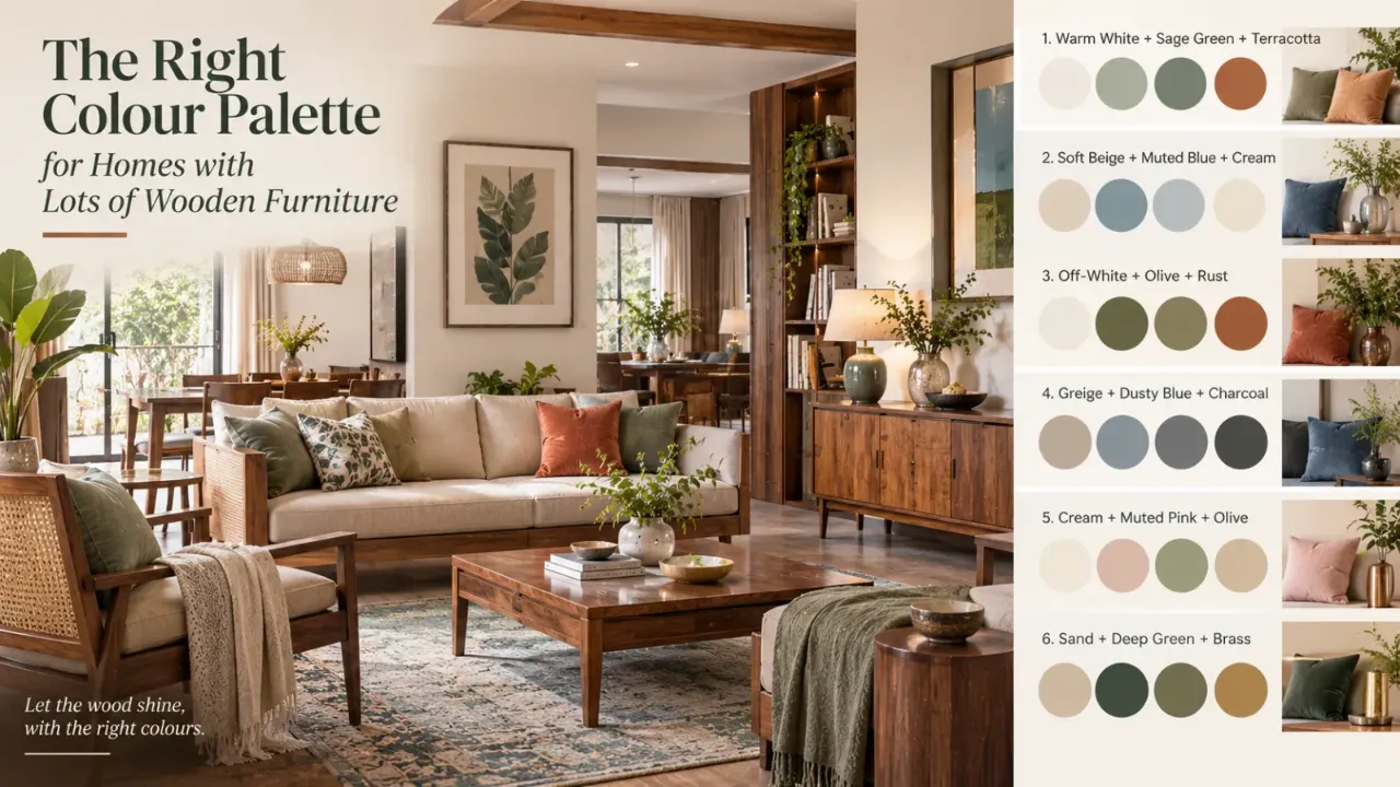
What colour palette suits a house with lots of wooden furniture
There is a reason wooden furniture remains such a dependable choice in Indian homes. It brings warmth, texture and character. But when a home has a lot of wooden furniture, choosing colours can become surprisingly difficult. The problem is not the wood. The problem is treating everything around it as another shade of brown.
Start by Looking at the Wood, Not the Paint
Before choosing a wall colour, look closely at the furniture you already own.
Is the wood honey-toned? Golden? Reddish? Deep brown? Almost black? Cool and pale?
The wood has an undertone, and that undertone affects which colours feel natural beside it.
Warm timber usually works comfortably with other warm or softened colours. But that does not mean every warm colour has to be used.
In fact, a carefully chosen cooler shade can create exactly the contrast the room needs.
Light Wood Needs a Different Strategy From Dark Wood
A room filled with pale oak-like or light timber furniture has a very different visual weight from one filled with dark teak, walnut or deep-stained pieces.
Light wood gives you more freedom to introduce colour without making the room feel heavy.
- Soft whites
- Muted greens
- Dusty blues
- Warm greys
- Terracotta accents
- Gentle creams
Deeper colours can also be introduced through artwork, cushions or one feature wall.
Dark wood already has a stronger presence. That means the surrounding palette often benefits from either lighter balancing shades or deliberate contrast.
Warm Wood Does Not Mean Everything Must Be Warm
If the furniture has a warm undertone, homeowners often assume they must use warm beige, cream, tan and brown everywhere.
That can work. But it can also create a room with no visual tension.
A slightly muted blue, soft green or cooler grey can balance warm timber surprisingly well.
The important word is muted. Very icy colours can sometimes feel disconnected from rich warm wood. Softer, more complex colours usually create a smoother transition.
The Easiest Palette: Warm Neutral + Wood + One Accent
For homeowners who do not want a complicated colour scheme, this is one of the safest approaches.
For example: Ivory + teak + olive, Warm white + walnut + dusty blue, or Sand + honey wood + terracotta.
The neutral gives the room breathing space. The wood provides warmth and texture. The accent gives the room personality.
Olive and Green Are Natural Partners for Wood
Green can bring freshness to rooms that already contain a lot of timber.
Muted olive, sage, moss and deeper earthy greens can work beautifully with wooden furniture.
Use them on walls, curtains, accent chairs, cushions, artwork, rugs or selected cabinetry.
Green does not have to dominate. Sometimes a small amount is enough to stop a wood-heavy room from feeling visually monotonous.
Blue Can Cool Down a Warm Interior
Blue is particularly useful when the furniture has a strong golden, honey or reddish character.
A soft dusty blue can introduce calm contrast without fighting the warmth of the timber.
For a richer look, consider:
- Muted navy
- Blue-grey
- Slate blue
- Deep teal used carefully
The darker the blue, the stronger the contrast becomes. That can be beautiful in a living room or study, but it is usually better treated as an accent rather than repeated across every surface.
Don't Underestimate Off-White
A very bright white can make warm timber look more yellow or orange by comparison.
A softer off-white, ivory or warm white can create a gentler transition.
This is especially useful when you already have several wood finishes in the room. The wall should not necessarily disappear. It should act as a quieter layer behind the furniture.
What About Beige?
Beige is not the enemy. The problem comes when beige is used automatically.
If the furniture is already medium or dark brown and the floor is another brown tone, adding beige walls, tan curtains and brown cushions can flatten the room into one continuous colour family.
Instead, vary the temperature and depth.
A warm neutral wall can be paired with a dusty green cushion, a muted blue rug, cream upholstery, darker artwork or a touch of brass or black.
Use Colour to Separate Different Woods
Many homes do not have one wood finish. There may be older teak furniture, newer walnut finishes and perhaps a light wood cabinet added later.
Trying to make every wood match perfectly can become frustrating.
A better strategy is to create a colour bridge.
A warm neutral may connect different timber tones. Olive may bridge warmer and darker woods. Black or dark bronze accents can provide another visual anchor.
The objective is not identical timber. It is visual relationship.
When the Furniture Is Very Dark
Dark wood can make a room feel sophisticated, but too much of it can become visually dense.
Try warm white walls, soft cream upholstery, light natural fabrics, pale rugs, muted green accents and brushed metallic details.
You do not need to make every surface light. The contrast works because the dark furniture becomes the anchor.
When the Furniture Is Very Light
Light wood gives you more permission to experiment.
You can introduce deeper colours through walls or larger soft furnishings without overwhelming the room.
- Forest green
- Deep teal
- Muted navy
- Clay
- Rust
- Charcoal
Even a dark accent wall can work if the rest of the room remains controlled.
If the Room Has a Lot of Traditional Furniture
A palette does not need to make traditional wood furniture look contemporary.
Rich but muted colours can work especially well here:
- Deep olive
- Burgundy
- Muted mustard
- Petrol blue
- Warm cream
- Terracotta
These colours should be placed intentionally. One strong wall or a few coordinated accents can be far more effective than covering the whole home in saturated colour.
If the Room Is Modern
Modern wooden furniture often has cleaner lines and simpler silhouettes.
Consider combinations such as:
Warm White + Walnut + Charcoal
A clean palette where darker wood remains the main visual anchor.
Greige + Oak + Olive
Quiet, layered and useful when the furniture needs to remain visually important.
Soft Beige + Teak + Black
Warmth with sharper definition through carefully placed black details.
Ivory + Light Wood + Dusty Blue
A softer contemporary combination with gentle cool contrast.
The Ceiling, Floor and Curtains Count Too
Homeowners often choose a wall colour while ignoring everything around it.
But when a room already has a lot of wood, the floor, curtains, upholstery and ceiling become part of the colour equation.
Imagine dark wood furniture, brown flooring, beige curtains, a cream sofa, a tan rug and beige walls.
There may be nothing technically wrong with any one element. Together, they can become too much of the same thing.
Instead, change one layer. Perhaps the curtains become a soft olive. Perhaps the sofa is a warm ivory. Perhaps the rug introduces a muted blue. Perhaps the wall moves slightly lighter.
You do not need to redesign the whole room. One carefully chosen layer can change the balance.
Use One Strong Colour, Not Many Competing Ones
When a wood-heavy room looks boring, the instinct can be to add more colour everywhere.
A better approach is to choose one strong supporting colour and repeat it in small amounts.
For example, olive on an accent chair, in artwork and in one cushion. The repetition creates a visual thread.
The same principle works with blue, terracotta, burgundy or even black.
Black Can Help Wooden Furniture Look More Contemporary
Black is useful because it creates definition.
A black light fixture, window frame, cabinet handle, table base or artwork frame can sharpen a room filled with softer wood tones.
But black works best as punctuation. Too much can make an already dark room feel heavy.
Metallic Accents Need Restraint Too
Metallic finishes can complement wood beautifully.
Brass and antique gold can reinforce a warm, classic look. Blackened metal can make the same wood feel more contemporary. Silver or cooler metals can create more contrast.
A few coordinated details usually look more sophisticated than mixing several unrelated metallic finishes.
Don't Try to Match the Wood With the Wall
A slightly lighter wall behind medium wood, a muted cooler shade behind warm timber or a deeper accent wall behind pale wood can each create a different kind of balance.
Let the Room's Lighting Influence Your Choice
The same colour can behave differently throughout the day.
A wall that feels soft and neutral in daylight may appear warmer under evening lighting. A grey may feel cooler. A green may become richer. A blue may appear deeper.
This is especially important when the room already contains significant wood because artificial light can reinforce the warmth of the timber.
So do not judge a colour only from a small sample under shop lighting. See how it behaves in the actual room and at different times of day.
What If You Love a Very Wood-Heavy Look?
Then do not fight it.
There is absolutely nothing wrong with a home where timber is one of the dominant visual materials.
The goal is simply to control the supporting palette.
Wood, cream, camel, olive, terracotta, antique brass and deep brown can form a rich, layered scheme.
The difference between “warm and layered” and “brown everywhere” comes down to contrast, texture and proportion.
The Three-Colour Test
A simple way to test your palette is to identify three major colour families in the room.
Colour 1: Background
Usually your wall, ceiling or largest surface.
Colour 2: Wood
Treat the existing furniture and timber finishes as a colour family rather than pretending they are neutral.
Colour 3: Accent
A supporting colour that appears in smaller quantities through textiles, artwork, rugs, accessories or selected furniture.
The Goal
Keep the three relationships balanced rather than making one colour compete with everything else.
Five Palettes That Work With Wooden Furniture
1. Ivory + Teak + Olive
Warm, earthy and relaxed. Ideal for homes that want warmth without becoming overly brown.
2. Warm White + Walnut + Dusty Blue
Calmer and more contemporary. The blue gives darker wood some breathing room.
3. Sand + Honey Wood + Terracotta
Soft and welcoming. Particularly effective when you want a warmer, more Indian-inspired atmosphere without making every surface brown.
4. Greige + Oak + Deep Green
Subtle but layered. Good for modern interiors where the furniture should remain visually important.
5. Cream + Dark Wood + Burgundy
Richer and more dramatic. Best used selectively so that the deeper colour remains an accent rather than overwhelming the room.
The Biggest Mistake: Matching Instead of Balancing
You do not need wood-coloured walls, wood-coloured curtains, wood-coloured cushions, wood-coloured rugs and wood-coloured décor.
You already have the wood.
Let it be the wood.
Your colours should help it stand out, soften it, cool it down, connect different timber tones or simply give the room somewhere for the eye to rest.
The Final Rule
When a home has lots of wooden furniture, start by treating the wood itself as one of your major colours.
Then ask:
- Is the room too warm?
- Is it too dark?
- Does it need more contrast?
- Does it need freshness?
- Does it need softness?
Once you answer that question, the colour palette becomes much easier to choose.
Because the right palette is not the one that matches the furniture perfectly. It is the one that makes the whole room feel balanced.
Final Thought
Wood is already doing a lot of visual work in a home. It brings warmth, texture, pattern and character.
You do not need to compete with it.
Choose colours that give it contrast where needed, softness where useful and enough visual breathing room to keep the room from becoming one continuous shade of brown.
The goal is not to reduce the wood. It is to make the wood look even better.
Ready to Visualise Your Colour Palette?
Walls to Wonder's Design My Room tool lets you upload a room photo and explore different colour and interior directions around your existing furniture.
Once you have a clearer palette and need professional guidance, you can also explore designers through the Walls to Wonder designer directory.
Frequently Asked Questions
1. What colours work best with wooden furniture?
Warm whites, creams, olive and sage greens, muted blues, soft greiges, terracotta and selected deeper accent colours can all work well. The best choice depends on the wood's tone and the amount of wood in the room.
2. What wall colour looks best with dark wooden furniture?
Lighter shades such as warm white, ivory, soft cream, stone or muted neutral colours can create useful contrast. Muted greens and blues can also work when introduced thoughtfully.
3. What colours go with light wood furniture?
Light wood can work with warm whites, soft neutrals, muted greens and blues as well as deeper accent colours such as forest green, teal, rust or charcoal.
4. Should my walls match my wooden furniture?
Not exactly. Matching the wall and furniture too closely can make the room feel flat. A coordinated contrast usually gives the furniture more definition.
5. Can blue and wooden furniture work together?
Yes. Muted blue, dusty blue, blue-grey and carefully selected navy or teal can create a useful cooler contrast against warm timber.
6. Is beige a good colour for a home with lots of wood?
Yes, but it should not be the automatic choice for every surface. Layer beige with contrasting colours, textures and lighter or deeper tones so the room does not become visually monotonous.
7. How many colours should I use in a wood-heavy room?
A simple starting point is to work with a background colour, the wood as a major colour family and one supporting accent. Additional shades can come through natural variations in fabrics, artwork and materials.
Turn this idea into a plan for your home
Visualise your space, understand the likely budget, or find a professional who can bring the idea to life.