
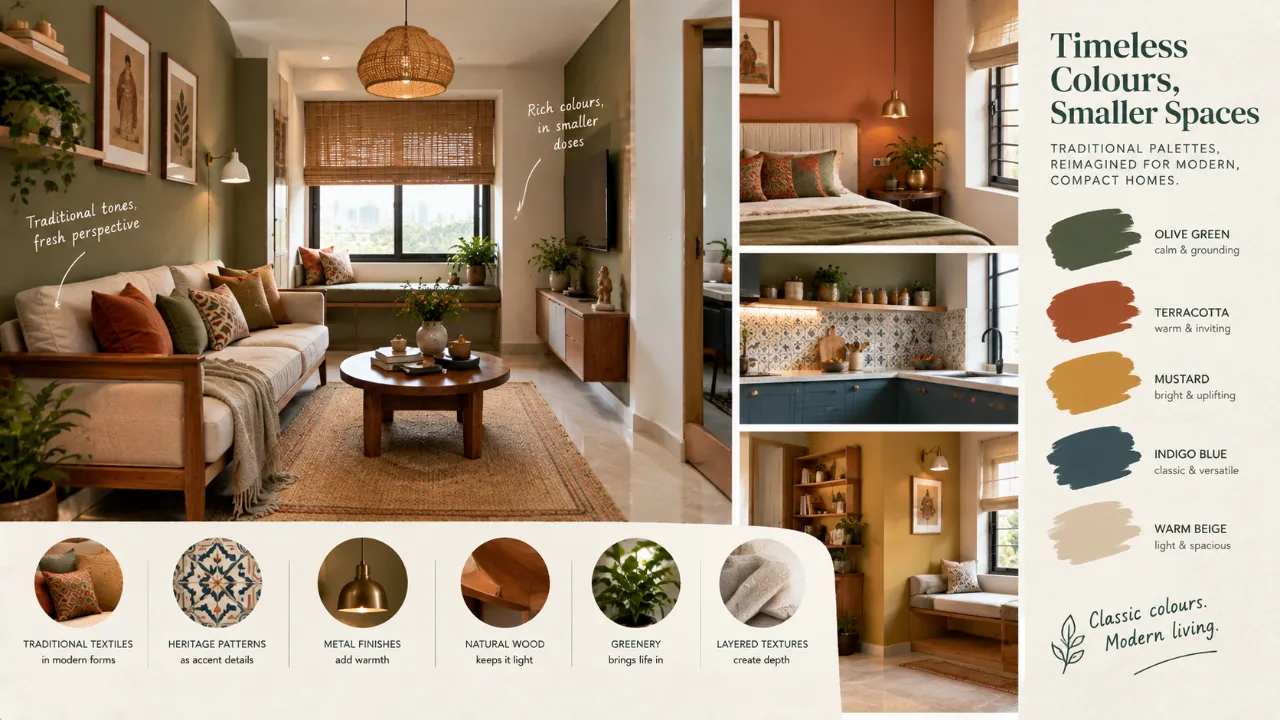
Traditional colour palettes reinterpreted for smaller spaces
Traditional interiors are often associated with colour: deep reds, rich greens, mustard yellows, indigo, terracotta, saffron, burgundy and warm wood tones.
These colours can bring warmth, history and personality into a home. But in a smaller space, the same palette can behave very differently.
A colour that feels rich and balanced in a large room can make a compact room feel darker or visually crowded when used without adjustment.
That does not mean traditional colours have to be replaced with plain white, pale beige or grey. It means they need to be reinterpreted.
The goal is not to make traditional colour disappear. It is to change its proportion, placement, intensity and relationship with the rest of the room.
- Traditional Colour Does Not Have to Mean a Dark Interior
- Give Each Colour a Role
- Use a Light Base
- Try Muted Versions of Rich Colours
- Think in Tonal Families
- Let Wood Carry Traditional Warmth
- Use Traditional Colours Through Textiles
- One Rich Element Can Be Enough
- Reinterpret Traditional Patterns
- Use Brass and Metal as Colour Partners
- Use Colour to Define Zones
- Traditional Colours in Kitchens
- Softer Palettes for Bedrooms
- Traditional Colour in Bathrooms
- Use the Entryway Strategically
- Common Mistakes
- A Simple Colour Formula
- FAQ
Traditional Colour Does Not Have to Mean a Dark Interior
One of the biggest misconceptions is that traditional palettes need deep colours across large surfaces.
A traditional palette can be built from a light architectural base and richer accents.
Ivory walls can sit alongside muted terracotta, walnut wood and brass. A soft cream room can carry indigo through cushions, artwork or a single furniture piece.
This creates a traditional mood without making the entire space feel heavy.
Start With the Colour's Role, Not Just the Colour Itself
The same colour can perform very differently depending on where it is used.
A deep green across an entire room becomes a major architectural statement. The same green in a chair, curtain border or artwork becomes an accent.
Use a Light Base to Give Traditional Colours Space
A lighter base is one of the easiest ways to adapt a traditional palette for a compact room.
- Ivory
- Warm white
- Soft cream
- Pale sand
- Light taupe
- Muted stone
These colours create a visually open background while allowing stronger traditional shades to appear selectively.
Try Muted Versions of Rich Traditional Colours
You do not always need the brightest or deepest version of a traditional colour.
Try terracotta, brick or muted rust.
Try olive, sage or moss.
Try ochre or muted mustard.
Try softened indigo or dusty blue.
Think in Tonal Families
A traditional palette can feel more sophisticated when several related shades are used instead of one dominant colour repeated everywhere.
For example:
Green: cream + olive + moss + walnut
Let Wood Carry Some of the Traditional Warmth
Traditional Indian interiors often gain warmth from wood as much as from colour.
Instead of adding more saturated paint, allow timber finishes, furniture and cabinetry to introduce depth.
Use Traditional Colours Through Textiles
Textiles are one of the easiest ways to reinterpret a strong palette.
- Cushions
- Curtains
- Rugs
- Throws
- Bedcovers
- Runners
- Upholstery
Textiles also make it easier to change the colour balance later.
One Rich Element Can Be Enough
In a compact room, one strong traditional colour can create enough character on its own.
- A deep green armchair
- A rust-coloured sofa
- An indigo headboard
- A burgundy artwork
- A mustard pendant
- A traditional patterned rug
Reinterpret Traditional Patterns at a Smaller Scale
Traditional colour and traditional pattern often appear together. But large, high-contrast patterns can become visually dominant in compact spaces.
Instead, control the scale. A smaller motif on cushions may work better than a large repeating pattern across every wall.
Use Brass and Metal Finishes as Colour Partners
Brass, antique gold and aged bronze can reinforce warm palettes, while black or dark bronze can provide stronger contrast.
The key is repetition. Choose a dominant metal finish and repeat it subtly through lights, handles, mirrors or accessories.
Let the Ceiling Stay Quiet
In a small room, every additional surface colour can increase visual complexity.
A soft neutral ceiling can help maintain visual openness even when the walls, furniture or textiles carry stronger traditional colours.
Use Colour to Define Zones
In compact homes, one room may perform several functions. Colour can help distinguish those zones without adding walls.
A muted green reading corner, a terracotta dining nook or an indigo work chair can establish subtle visual zones.
Traditional Colours Can Work in Kitchens Too
A compact kitchen does not necessarily need heavy traditional cabinetry.
Use a lighter main cabinet tone and introduce traditional colour through backsplash tiles, open shelving, handles, bar stools, small appliances or accessories.
Bedrooms Benefit From Softer Versions
Instead of using a saturated colour everywhere, consider combinations such as:
- Warm cream + muted olive + walnut
- Ivory + dusty indigo + natural wood
- Sand + terracotta + antique brass
Bathrooms Can Use Traditional Colour in Small Doses
A traditional palette can appear through patterned tiles, a coloured vanity, brass fittings, a textured floor, a framed mirror or a small feature wall.
Entryways Are Good Places for Richer Colour
A deep green console, terracotta artwork, patterned runner or dark wood finish can establish the home's personality immediately.
Use the Same Accent in Multiple Rooms
A small home benefits from visual continuity.
Instead of making every room different, select one or two recurring traditional colours.
For example, olive can appear in the living room, bedroom textiles and small kitchen accessories. Terracotta can move from artwork to dining upholstery and entryway styling.
Avoid the "Traditional Theme" Trap
Traditional colour does not mean the home needs to become a historical recreation.
A room can combine a traditional-inspired colour, contemporary furniture, simple cabinetry, modern lighting and natural materials.
Common Mistakes When Using Traditional Colours in Small Spaces
Using dark colours on every surface
Rich colour can become heavy when repeated across walls, ceiling, furniture and textiles.
Using too many strong colours together
A restrained palette is easier to control in a compact home.
Choosing colours independently
Traditional colours look better when their undertones relate to one another.
Making every element decorative
A smaller room benefits from a clear hierarchy. Not everything needs to become a focal point.
Ignoring natural light
The same colour can look different depending on the amount and direction of available light.
A Simple Traditional Palette Formula for Small Homes
Ivory, warm white, cream, sand or another soft neutral.
30% — Supporting Warmth
Natural wood, muted taupe, soft stone or another grounding material tone.
10% — Traditional Accent
Terracotta, olive, indigo, mustard, rust, burgundy or another chosen heritage-inspired colour.
The percentages are not strict rules. The idea is to give stronger colours enough presence to be noticed without allowing them to visually consume the room.
Traditional Does Not Mean Old-Fashioned
The most successful reinterpretations usually keep the spirit of a traditional palette rather than reproducing an entire traditional room.
You might take the warmth of terracotta, the depth of indigo, the earthiness of olive, the richness of brass and the softness of ivory—and combine them with modern proportions and contemporary furniture.
The Best Place to Experiment Is With Layers
If you are uncertain about a strong traditional colour, do not commit to it everywhere immediately.
Layer it gradually: start with a neutral base, add the wood, introduce one textile, then one accent object and assess the room.
Explore Colour Before You Commit
Seeing how different colours and styles work within your actual room can make it easier to move from inspiration to a more confident design direction.
Final Thought
Small spaces do not require you to abandon traditional colour. They require you to become more selective about how you use it.
Instead of covering every wall in rich tones, let traditional colour appear through proportion, materials, textiles, furniture, artwork and carefully chosen accents.
Use lighter bases. Repeat colours with intention. Control contrast. Let wood and texture carry some of the warmth.
And most importantly, remember that tradition is not about reproducing the past exactly. It is about taking what is beautiful in that visual language and giving it proportions that work for the home you have today.
FAQ
Yes. Dark colours can work when used selectively and balanced with lighter surfaces, suitable lighting and enough visual breathing room.
Warm neutrals, terracotta, muted olive, ochre, indigo, rust, burgundy and warm wood tones can all be adapted depending on the room, light and overall palette.
Not necessarily. Light colours can help create visual openness, but carefully chosen darker accents can add depth and personality.
Pair traditional-inspired colours with simpler furniture, cleaner lines, contemporary lighting and fewer decorative elements.
There is no fixed number, but a restrained palette with one or two stronger accents often makes it easier to maintain visual continuity.
Yes. Traditional colour can be separated from traditional furniture and used with modern materials, proportions and layouts.
Turn this idea into a plan for your home
Visualise your space, understand the likely budget, or find a professional who can bring the idea to life.