
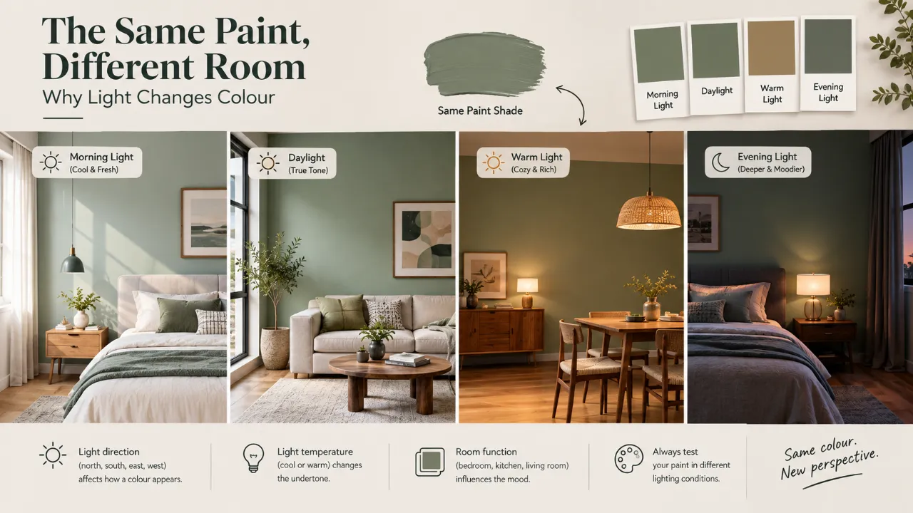
The Same Paint, Different Room: Why Light Changes Colour
You choose a paint colour.
You test it on a small card. You see it in the store. You bring it home.
In daylight, it looks perfect.
Then the sun goes down. You switch on the lights. And suddenly the wall looks warmer, cooler, yellower, greyer or darker.
The paint has not changed.
The light has.
Warm vs. Cool Lighting: What Does It Actually Mean?
The terms “warm” and “cool” refer to the colour appearance of a light source, generally described using correlated colour temperature (CCT) in Kelvin.
Lower Kelvin
Generally warmer, more yellow or amber-looking light.
Higher Kelvin
Generally cooler, whiter or bluer-looking light.
A common residential range is on the warmer side, while cooler light is often used where a crisper visual environment is desired.
Why Your Paint Changes at Night
During the daytime, your walls may be influenced primarily by natural light. At night, artificial light takes over.
Those two light sources can have different spectral characteristics. Your paint reflects some of that light toward your eyes. Change the light, and the reflected light changes.
So when someone says, “The paint looked completely different at night,” they are not imagining it.
Your Paint Colour Has Undertones
A paint colour is rarely as simple as the label suggests.
| Base Colour | Possible Undertones |
|---|---|
| White | Blue, yellow, pink, green |
| Beige | Pink, yellow, grey, green |
| Grey | Blue, violet, green, brown |
| Taupe | Pink, violet, grey, brown |
These subtle undertones can become much more visible under different lighting.
The Same Neutral Is Not Always the Same Neutral
Neutral colours are especially deceptive.
A warm white can look clean and soft in daylight but appear noticeably creamier under warm artificial light.
A cool white can look crisp in daylight but feel colder under cool artificial lighting.
A greige can shift depending on whether its underlying balance leans more toward beige or grey.
Your Room's Direction Also Changes the Picture
Natural light is not identical all day. The direction a room faces influences the type and amount of daylight it receives.
East-Facing
Typically stronger morning light.
West-Facing
Often becomes warmer later in the day.
North-Facing
Can receive cooler-looking, less direct daylight.
South-Facing
Can receive stronger, warmer-feeling daylight depending on location and season.
These are broad tendencies, not fixed rules. Climate, windows, shading and surrounding buildings also affect the result.
Why West-Facing Rooms Can Surprise You
A west-facing room may feel relatively subdued in the morning and much warmer later in the afternoon as sunlight changes.
Then, after sunset, the wall is under artificial lighting again.
One room can therefore produce several different visual readings of the same paint colour.
Artificial Lighting Becomes the Main Character at Night
Once daylight disappears, your bulbs become the dominant source of illumination.
Imagine a warm beige wall under a warm 2700K-style light. It may appear richer, creamier and more golden.
Put the same wall under a cooler 4000K-style light and its appearance can move in a different direction.
Neither result is necessarily wrong. The question is which result you actually want.
Warm Lighting Does Not Automatically Make Every Colour Better
Warm light can create a softer, more relaxed atmosphere, but it does not automatically flatter every paint colour.
Warm light can intensify yellow, cream and certain red or orange undertones.
Cool Lighting Does Not Automatically Mean “Better Visibility”
Cooler light can create a cleaner, brighter visual impression and may suit spaces where a more neutral atmosphere is desired.
However, substantially cooler light may work against a warm palette built around timber, cream upholstery, brass, natural stone and soft textiles.
CRI Also Matters
Colour temperature is only part of the equation.
The Colour Rendering Index, or CRI, is commonly used to describe how accurately a light source renders colours compared with a reference source.
A higher CRI generally indicates better colour rendering, although CRI is not a complete description of lighting quality.
Paint Finish Changes How the Colour Is Perceived
It is not only the light source.
The paint's finish also plays a role. A shinier surface can reflect light differently from a flatter finish, changing how the colour appears from different viewpoints.
This is another reason to judge the final surface rather than relying entirely on a tiny colour card.
What Is Metamerism?
Metamerism occurs when two colours appear to match under one light source but no longer look like a match under another.
This matters when you are coordinating paint with curtains, sofas, rugs, wood finishes, tiles, upholstery or artwork.
Why Paint Samples Should Go on the Actual Wall
Do not make the final decision based only on a phone screen, website image, tiny colour card or showroom wall.
Instead, place a reasonably large sample in the actual room.
- Observe it in morning daylight.
- Check it around midday.
- Look at it in the afternoon.
- Check it after sunset.
- Switch on the actual artificial lights.
The paint should be judged in the environment where it will actually be used.
Do Not Test the Paint Only on a White Wall
A small patch can tell you something, but context matters.
Nearby flooring, wood, curtains, furniture and other finishes can all influence how the sample is perceived.
Use a sufficiently large sample and look at it alongside the materials that will remain in the room.
Test All the Major Materials Together
Do not approve wall paint, flooring, curtains, sofa fabric, stone and metal finishes independently.
Put the key samples together and view them under the lighting that will actually be used.
The Same Paint Can Work Beautifully in One Room and Poorly in Another
This is why copying colour schemes from another home can be misleading.
- Different daylight
- Different window orientation
- Different flooring
- Different ceiling colour
- Different artificial lighting
- Different furniture
- Different room proportions
Ask: “Does this colour look good here?”
Light-Coloured Paints Are Not Always “Safe”
A warm white can become creamier. A cool white can become sharper or bluer. A pale grey can reveal blue or violet undertones.
Light colours can be particularly sensitive to their lighting environment because surrounding light becomes a large part of what you perceive.
Dark Paints Change Too
A deep green can become richer under warm light. A deep blue can shift depending on its undertone and the light source. A charcoal can reveal blue, brown or green characteristics.
Dark colours can also make the room feel substantially different as the overall illumination changes.
Natural Light and Artificial Light Should Work Together
The goal is not necessarily to make daylight and artificial light identical. They simply need to feel compatible.
Morning can feel fresh, afternoon can feel brighter and evening can feel warmer. That transition can become part of the room's character.
Think About When You Use the Room Most
| Room | Important Lighting Condition to Test |
|---|---|
| Living Room | Daylight + evening ambient and decorative lighting |
| Bedroom | Night-time lighting |
| Home Office | Primary working hours + screen conditions |
| Kitchen | Daylight + task lighting |
| Dining Room | Evening decorative and ambient lighting |
Your Lighting Can Sometimes Fix a Paint Problem
If you have already painted the room and the colour looks slightly wrong at night, test the lighting before repainting.
A change in colour temperature can significantly alter how the wall appears.
Do Not Mix Random Colour Temperatures
One warm bulb, one cool white downlight and another neutral fixture can produce a visually inconsistent room.
When possible, create a deliberate relationship between the main light sources, especially in open-plan spaces where several fixtures are visible at once.
A Simple Paint-and-Lighting Test
Step 1
Choose two or three finalists.
Step 2
Apply large samples.
Step 3
Leave them in the actual room.
Step 4
Observe them throughout the day.
Step 5
Switch on the actual lights.
Step 6
Compare them with the room's other materials.
A Quick Warm vs. Cool Lighting Guide
| Lighting Character | Typical Visual Effect | Paints It May Emphasise |
|---|---|---|
| Warm | Cosier, more golden | Creams, yellows and warm neutrals |
| Neutral | More balanced | Broad range of colours |
| Cool | Crisper, whiter or slightly bluish | Cool whites, blues and some greys and greens |
These are general tendencies rather than guarantees. The actual result depends on the specific light source, its spectral characteristics, paint pigments, room conditions and surrounding finishes.
The Biggest Paint-Selection Mistakes
- Choosing only from a phone or computer screen
- Looking only during daylight
- Ignoring room orientation
- Choosing paint before lighting
- Ignoring colour rendering
- Matching only tiny samples
- Testing only one part of the room
- Assuming a “neutral” will behave consistently everywhere
The Better Way to Choose Paint
This process takes slightly more planning, but it can save you from repainting an entire room.
Plan the Colour and Light Together
A successful interior is not just about choosing the right colour or the right light separately. The two need to work together within the actual room.
Explore Design My Room, estimate your Interior Design Cost, or explore Interior Designers.
The Final Takeaway
Your paint colour is not an isolated object. It is constantly being interpreted through light.
Daylight can make it feel different from artificial light. Warm bulbs can emphasise some undertones. Cooler sources can reveal others. Room orientation changes natural-light conditions. Finish affects reflection. Colour rendering affects how materials appear. Surrounding finishes influence what you perceive.
That is the question that prevents the classic: “But it looked completely different in the store.”
Frequently Asked Questions
Artificial lighting has different colour characteristics from daylight. When the light source changes, the way your eyes perceive the paint and its undertones can change too.
Neither is universally better. The right choice depends on the paint, undertones, room function, surrounding materials and atmosphere you want.
Lower Kelvin values generally appear warmer and more yellow or amber, while higher values appear cooler and whiter or bluer. Residential lighting commonly uses warmer colour temperatures, depending on the room and preference.
If the white contains warm undertones, warm artificial lighting can make those characteristics more noticeable, making the wall appear creamier or more yellow.
Yes. Test a large sample in the actual room and observe it during daylight and under the lighting you plan to use after sunset.
Yes. The quality and intensity of natural daylight can vary with room orientation, time of day, season, windows, shading and surrounding buildings.
Turn this idea into a plan for your home
Visualise your space, understand the likely budget, or find a professional who can bring the idea to life.