
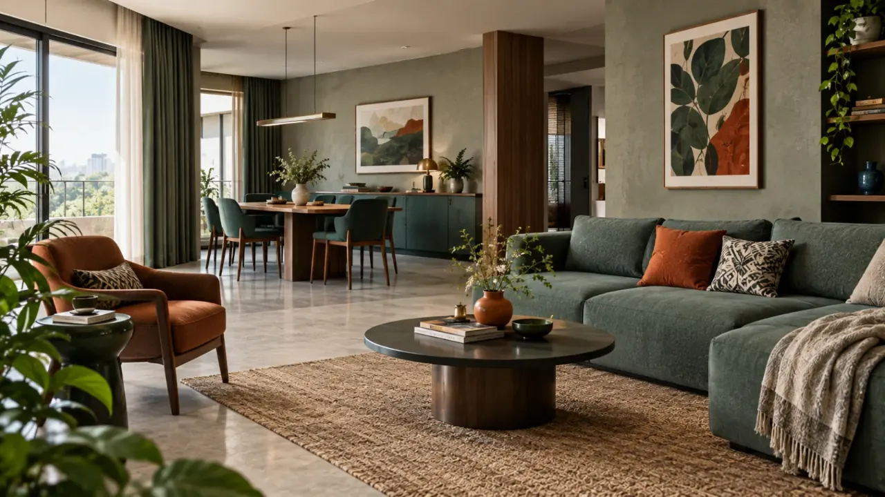
The Colour Balance Cheat Code: Understanding 60-30-10
Choosing colours for a room can become surprisingly complicated. You like the beige, then the green, then the walnut wood, the brass and the patterned rug.
Individually, every choice seems good. Together, the room can quickly become too busy. This is where the 60-30-10 rule becomes useful.
It gives you a simple way to think about visual colour balance: 60% dominant colour, 30% supporting colour and 10% accent colour.
- What Is the 60-30-10 Rule?
- What Does the 60% Mean?
- What Does the 30% Mean?
- What Is the 10% Accent?
- Why the Rule Works
- Think Visual Weight, Not Literal Percentage
- Start With What Already Exists
- Three Palette Examples
- Materials Count Too
- How the Rule Changes Room by Room
- The Accent Does Not Have to Be Bright
- Can You Use Two Accent Colours?
- You Can Shift the Ratio
- When 70-20-10 May Work Better
- When 50-35-15 May Work Better
- When to Break the Rule for Architecture
- When to Break It for Monochromatic Interiors
- When Texture Is Doing the Work
- When You Want a Dramatic Room
- When the Room Is Very Small
- When There Is a Strong Focal Object
- When Personal Collections Matter
- Why Lighting Changes the Ratio
- Use the Rule as a Decision-Making Tool
- A Simple Colour-Planning Framework
- Signs That You Should Break the Rule
- The Real Rule Behind the Rule
- Practical Checklist
- FAQ
What Is the 60-30-10 Rule?
The idea is simple. One colour family does most of the visual work. A second colour or material family supports it. A smaller accent creates contrast and interest.
30% → Supporting Colour or Material
10% → Accent Colour
The percentages are not meant to be measured with a calculator. You are thinking about visual weight, not exact square metres.
What Does the 60% Actually Mean?
The 60% colour is the background or dominant visual family. It is usually found in the largest surfaces or largest visual elements.
- Walls
- Large rugs
- Flooring
- Large upholstery
- Major cabinetry
- Curtains
The dominant colour sets the overall mood of the room. It does not have to be a single paint colour. It can be a family of related tones.
What Does the 30% Mean?
The 30% adds depth and variation.
- Furniture
- Wood
- Secondary walls
- Drapery
- Rugs
- Cabinetry
- Upholstery
- Large decorative elements
The supporting colour should relate to the dominant colour rather than competing with it.
What Is the 10% Accent?
The accent is the smallest colour layer, but often the most noticeable. It creates contrast and emphasis.
A strong artwork can become the room's accent without requiring many additional decorative pieces.
Small textiles can introduce a controlled accent without overwhelming the palette.
One accent chair or side table can provide stronger visual emphasis.
Lamps, throws and smaller objects can repeat the accent selectively.
Why the Rule Works
The human eye looks for hierarchy. When everything has equal visual importance, nothing feels particularly important.
The 60-30-10 rule creates a simple hierarchy: one colour leads, one supports and one interrupts.
This can also help you make decisions in stages. Choose the dominant family first, decide what should support it, and then introduce a controlled accent.
The 60-30-10 Rule Is About Visual Weight, Not Literal Percentage
A room with white walls and one dark navy sofa may contain very little navy physically, but the sofa may create significant visual impact.
Similarly, a small black sculpture on a white console can create strong contrast.
Start With What Already Exists
Before applying the rule, identify the colours already present in the room.
- Flooring
- Kitchen cabinetry
- Sofa
- Curtains
- Stone countertops
- Large built-ins
- Existing furniture
These elements are already contributing to the colour hierarchy. They should be considered before adding new colours.
Three Simple 60-30-10 Examples
60% warm ivory
30% walnut and mocha
10% muted olive
60% soft ivory
30% deep navy and dark wood
10% antique brass
60% warm beige and cream
30% terracotta and natural wood
10% deep olive
60% soft white
30% light wood and taupe
10% charcoal
Materials Are Colours Too
Colour does not only come from paint. Wood, stone, metal, glass, fabric, leather, cane and ceramic all contribute colour and visual weight.
A walnut cabinet may effectively become part of the 30%. A brass light fixture may function as part of the 10%. A beige stone floor may be part of the 60%.
The Rule Works Differently in Every Room
The same 60-30-10 palette does not have to be distributed equally throughout the home.
60% beige + 30% walnut/taupe + 10% olive
60% soft cream + 30% dusty blue + 10% olive or brass
60% warm neutral + 30% rich wood + 10% terracotta or brass
60% warm taupe + 30% walnut + 10% deep blue or green
Do Not Assume 60% Means “Paint 60% of the Walls”
The 60% is not a wall-area calculation.
A room with white walls, a large beige sofa, a beige rug and natural flooring may already have a dominant neutral even if the walls themselves are not beige.
Think about the entire visual field rather than individual surfaces.
The 10% Accent Does Not Have to Be Bright
People often interpret “accent” as bright red, yellow or electric blue.
It does not have to be.
- Deep olive
- Burgundy
- Charcoal
- Navy
- Antique brass
- Rust
- Dark brown
- Muted teal
The important thing is contrast, not brightness.
You Can Use Two Accent Colours
Real interiors can be more flexible than the traditional version of the rule.
Or the accent could combine burgundy and dark bronze. The more accent colours you introduce, the more important the dominant and supporting layers become.
You Can Shift the Ratio
A room can work as 70-20-10, 50-35-15 or 65-25-10.
A very calm interior may need a larger dominant layer. A richer interior may support a stronger supporting or accent layer.
When 70-20-10 May Work Better
20% natural wood
10% black
This can create a clean, contemporary composition with less visual competition.
When 50-35-15 May Work Better
35% deep green
15% antique brass and rust
Here, the supporting colour becomes a stronger part of the room's identity. This can work when the architecture and lighting can support more contrast.
Break the Rule When the Architecture Is Already Doing the Talking
A room with exposed brick, strong stone flooring, ornate woodwork, large windows or decorative ceiling details already has significant visual complexity.
Trying to impose 60-30-10 too rigidly may make the room feel artificially controlled.
Let the architecture establish the hierarchy and use colour selectively.
Break It When the Palette Is Monochromatic
Monochromatic interiors often use many variations of one colour family: cream, beige, taupe, mocha and soft brown, for example.
There may be no obvious 10% contrasting accent.
The interest can instead come from texture, material, shape, lighting, pattern and tone.
Break It When Texture Is Doing the Work
A room can be almost entirely neutral and still feel rich.
Creates a calm background layer.
Adds softness and texture without introducing a strong colour.
Adds natural variation and material depth.
Provide warmth and visual richness without requiring a bold accent.
In this kind of room, forcing a strong accent colour simply to satisfy the formula may weaken the design.
Break It When You Want a Deliberately Dramatic Room
Some spaces are supposed to feel dramatic.
That is far from 60-30-10, but it can still have hierarchy.
The real principle is that one element should lead, another should support and the rest should be controlled.
Break It When the Room Is Very Small
Small rooms can behave differently because strong accents can feel much larger when there is less visual distance between objects.
A compact bathroom, for example, may already contain tile, vanity, mirror, metal fittings, towels and lighting.
A more restrained ratio such as 80-15-5 may create more visual calm than a traditional 60-30-10 split.
Break It When the Room Has a Strong Focal Object
Maybe you have a large artwork, dramatic sofa, patterned rug, statement chandelier, colourful chair or sculptural stone table.
One object may already function as the visual accent.
Break It When Personal Collections Are Part of the Room
A home filled with books, art, travel objects or collected pieces may naturally contain more colour variation.
Trying to force everything into three colour categories can make the home feel overly edited.
In these interiors, the furniture and architecture can provide the base while the collection creates a naturally varied accent layer.
Lighting Changes How the Ratio Feels
Colour does not look the same under every light.
Warm artificial lighting can deepen some colours. Cool lighting can change others. Natural daylight can make colours appear more open or muted depending on the room.
A colour that feels like a subtle accent during the day might become much stronger at night.
Use the Rule as a Decision-Making Tool
The biggest benefit of 60-30-10 is not the final percentage. It is what it helps you decide.
Is this object or finish part of the main colour family?
Does it add depth while remaining related to the main palette?
Does it deliberately attract attention?
Is it introducing a new colour without a clear role?
A Simple Way to Choose Your Colours
Step 2: Identify the dominant colour family.
Step 3: Add a supporting colour or material.
Step 4: Select one controlled accent.
Step 5: Test the palette under real lighting.
Step 6: Adjust the ratio based on the room.
Signs That You Should Break the Rule
- The room already has strong architectural character.
- A monochromatic palette is the design intention.
- Texture is providing most of the visual variation.
- A major artwork or furniture piece is already the focal point.
- The room is very small.
- A personal collection naturally introduces colour.
- The 10% accent starts feeling artificial.
- Materials already create enough contrast.
The Real Rule Behind the Rule
The 60-30-10 formula is useful because it teaches a deeper principle:
A well-designed interior usually has a visual order.
Something creates the background. Something creates depth. Something creates emphasis.
That can happen through colour, but it can also happen through texture, material, shape, scale, lighting, pattern or architecture.
A Practical 60-30-10 Checklist
Supporting — What colour or material creates depth?
Accent — What catches the eye?
Existing Elements — What colours are already fixed?
Visual Weight — Which elements feel larger than their physical size?
Lighting — Does the palette change significantly between day and night?
Texture — Is texture already providing enough variation?
Focal Point — What should people notice first?
Use the Rule Until You Understand Why You Are Breaking It
Start with the formula if you are unsure. It gives you a structure.
If the room needs more calm, increase the dominant layer. If it feels flat, strengthen the supporting layer. If nothing stands out, introduce an accent.
If the room already feels rich, perhaps you do not need the accent at all.
Build a Colour Palette That Fits Your Space
A colour rule is a useful starting point, but the right palette still depends on your room, furniture, lighting and personal style.
Final Thought
The 60-30-10 rule is helpful because it makes colour planning less intimidating.
It gives you three simple questions: What should dominate? What should support it? What should stand out?
But a good interior does not become successful simply because its colours add up to 100%.
Sometimes the right room is 70-20-10. Sometimes it is almost monochromatic. Sometimes architecture, texture or a meaningful collection does all the visual work that a traditional accent colour would normally provide.
The percentage is a guideline.
The hierarchy is the real lesson.
Use the rule to create balance, then break it when the room has a good reason to be different.
FAQ
It is a colour-balancing guideline that suggests using roughly 60% of a dominant colour family, 30% of a supporting colour or material and 10% as an accent.
No. The percentages are approximate. The rule is best used to create visual hierarchy rather than as a strict mathematical calculation.
The dominant colour usually appears across the largest visual elements, such as walls, floors, large furniture, rugs, curtains or major cabinetry.
The 30% layer usually provides supporting colour or material through furniture, wood, secondary finishes, rugs, curtains and other larger visual elements.
No. An accent can be a deep or muted colour such as navy, olive, burgundy, charcoal or rust. Contrast matters more than brightness.
You can move away from the formula when a monochromatic palette, strong architecture, layered textures, a major artwork, a personal collection or a small room already provides enough visual hierarchy.
Yes. Wood, stone, metal, leather, fabric and other materials have colour and visual weight, so they can contribute to the dominant, supporting or accent layers.
Yes. Multiple accents can work when they remain controlled and connected. You can treat them as part of the same smaller accent layer rather than giving every accent equal visual importance.
Turn this idea into a plan for your home
Visualise your space, understand the likely budget, or find a professional who can bring the idea to life.