
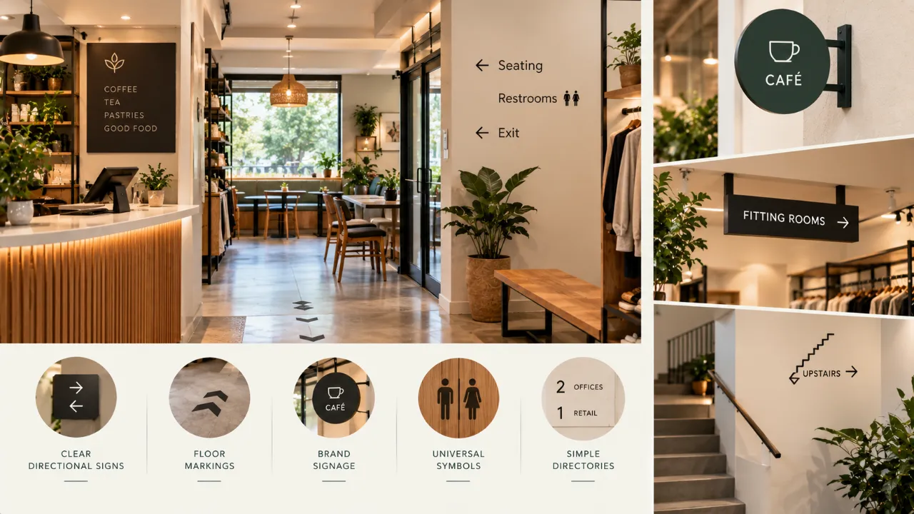
Small Space, Clear Direction: A Guide to Better Signage
In a small commercial space, people should not have to stop and wonder where to go. They should be able to enter, understand the layout and find what they need with minimal effort.
That is the purpose of signage and wayfinding.
But in compact spaces, signage presents a particular challenge. There are fewer walls, less distance between functions, more visual competition and often every available surface is already being used for branding, displays, furniture, lighting or information.
Good wayfinding does not add more noise. It reduces uncertainty.
- Signage and Wayfinding Are Not the Same Thing
- Start With the Visitor's Journey
- Identify Decision Points
- Create a Signage Hierarchy
- Keep the Entry Sign Simple
- Use Signage Only When It Solves a Problem
- Make Directions Easy to Scan
- Typography Is Part of Wayfinding
- Use Colour as a Navigation Tool
- Use Icons Carefully
- Placement Matters
- Repeat Directions When Necessary
- Use Architecture to Support Wayfinding
- Keep Branding and Wayfinding Connected
- Choose Materials Carefully
- Use Lighting Strategically
- Consider Accessibility
- Create a Signage Schedule
- Common Signage Mistakes
- Test the Wayfinding
- Simple Wayfinding Framework
- FAQ
Signage and Wayfinding Are Not the Same Thing
Signage is the visible communication system—room names, directions, warnings, information, branding and identification.
Wayfinding is the larger experience of understanding where you are, where you need to go and how to get there.
A small commercial space may have attractive signs but poor wayfinding. Good design considers the entire journey:
Start With the Visitor's Journey
Before designing a sign, map what a first-time visitor actually experiences.
Imagine entering the space without knowing anything about it. What do you see first? Where do you need to make a decision? What would confuse you?
A sign is most useful when it answers a question at the moment the visitor has it.
Identify Decision Points First
You do not need signage everywhere. You need it where people have to make choices.
- The entrance
- A corridor junction
- A staircase
- A lift lobby
- A reception area
- A waiting zone
- A restroom junction
- Multiple service counters
- Separate rooms or departments
Create a Signage Hierarchy
Not all signs should look equally important.
Where am I?
Which way should I go?
What is this room, counter or zone?
What do I need to know here?
Keep the Entry Sign Simple
The entrance is often the first branding opportunity, but branding and wayfinding are not necessarily the same thing.
Think about what a visitor needs immediately: where the entrance is, where reception is, whether there is a queue and where the visitor should go first.
Use Signage Only When It Solves a Problem
One of the biggest mistakes is adding signs simply because there is an empty wall.
If you cannot answer that, the sign may not be necessary.
Make Directional Information Easy to Scan
Visitors rarely read signage like an article. They scan it.
- Keep wording concise.
- Group related information.
- Make destinations easy to distinguish.
- Position signs where people naturally look.
Typography Is Part of Wayfinding
Decorative typography may suit branding, but it can become difficult to scan when used for directional information.
Think about letter size, spacing, contrast, line length, consistency and viewing distance.
Colour Can Help People Understand the Space
Colour can act as a navigation tool.
Blue → Consultation
Green → Customer Service
Purple → Waiting
The exact colours depend on the brand and environment. The key is consistency.
But Do Not Depend on Colour Alone
Combine colour with text, icons, numbers or symbols so important information remains understandable without relying on colour alone.
Use Icons Carefully
Icons can communicate quickly when they are familiar and consistently designed.
But too many custom icons can create another visual language visitors need to learn. A small space usually benefits from simplicity.
Placement Matters as Much as the Sign Itself
A beautifully designed sign can fail simply because it is placed too late or too high.
A directional sign should appear before the decision point, not after it.
Repeat Directions When Necessary
A visitor may need reassurance after turning. Small confirmation signs can help at important points on longer or less obvious routes.
Use Architecture to Support Wayfinding
The best wayfinding does not always rely on signs.
Changes in flooring, ceiling height, lighting, colour, furniture arrangement or wall treatment can establish different zones.
These architectural cues can reduce the amount of signage needed.
Small Spaces Need Strong Visual Hierarchy
In a compact commercial interior, everything is close together. A brand logo may sit beside a room number. A promotional poster may sit near a directional arrow.
A useful order is:
Keep Branding and Wayfinding Connected
A signage system should feel like it belongs to the business through brand colour, material language, typography, logo use and graphic details.
But branding should not overpower function.
Materials Matter Too
Signage materials should suit the environment.
- Acrylic
- Metal
- Wood
- Glass
- Vinyl
- Painted panels
- Integrated architectural elements
The best choice depends on durability, cleaning, lighting, brand language and installation conditions.
Lighting Can Turn Signage Into Architecture
Backlit letters, illuminated panels, wall washing or integrated lighting can create emphasis.
However, not every sign needs to glow. In a small space, excessive illuminated signage can make the environment feel visually crowded.
Reception Should Be Obvious
If a business has a reception desk, visitors should usually understand where to go without having to ask.
Positioning, lighting, colour, architectural framing, signage and staff visibility can work together to create this clarity.
Restroom Signage Needs Zero Ambiguity
A visitor should not have to interpret a decorative concept to understand which door to use.
Use clear identification and add directional signage when needed to reach the restroom from the main public zone.
Small Retail Spaces Need Different Cues
Retail wayfinding may include entrance and exit, billing, trial rooms, product categories, customer service, restrooms and pickup areas.
Signage should guide shoppers without competing unnecessarily with merchandise.
Offices Need to Balance Visitors and Employees
Employees may learn a workplace layout quickly. Visitors do not.
Useful public wayfinding may identify reception, meeting rooms, waiting areas, restrooms, lifts and other visitor destinations.
Accessibility Should Be Part of the Planning
Signage should not be designed only for people who can easily see and read everything from a standing position.
Depending on the type of space and applicable requirements, accessibility considerations may influence sign height, contrast, tactile information, symbols, typography, placement and clear routes.
Consider Multilingual Signage Where Needed
In spaces serving diverse visitor groups, multilingual information may be necessary.
Because adding languages increases visual information, structure the content carefully with hierarchy, spacing and grouping.
Do Not Wait Until the Interior Is Finished
One common mistake is completing the interior first and then asking where all the signs should go.
The signage plan should be considered alongside architecture, furniture, lighting and branding.
Create a Signage Schedule
Before fabrication, make a simple list for every sign.
This makes the system easier to coordinate and reduces last-minute confusion.
Common Signage Mistakes in Small Commercial Spaces
Putting signs where they are easy to install
The easiest wall is not necessarily the best location for the visitor.
Making every sign the same size
Different information levels need different levels of emphasis.
Using decorative typography for directions
Brand personality should not reduce legibility.
Relying entirely on colour
Use multiple ways to communicate important information.
Adding signs after construction
Late placement can create visual and coordination problems.
Letting promotional graphics compete with navigation
A visitor should not have to search for a basic directional cue among advertisements.
A Simple Wayfinding Test
Choose someone who does not know the space and ask them to enter, find reception, locate a specific room or service, find the restroom and return to the exit.
Do not explain the route. Watch where they stop and what they look at.
A Simple Signage Framework
Direct — Which way do I go?
Confirm — Am I still going the right way?
Arrive — Have I reached the correct destination?
Inform — What else do I need to know?
Plan a Commercial Space That Communicates Clearly
A strong commercial interior connects layout, branding, furniture, lighting and visual communication. Explore design resources and tools to develop your space before making final decisions.
Final Thought
Good signage should not make people feel like they are reading a map. It should make the space feel intuitive.
The best small commercial wayfinding systems combine clear information with architecture, furniture, colour, lighting and branding so that visitors naturally understand where to go.
Use fewer signs where possible. Make important information easy to scan. Place signs before decisions, not after them. And design the system as part of the interior—not as something attached once everything else is finished.
When wayfinding works, people spend less time asking where they need to go and more time experiencing the space itself.
FAQ
What is the difference between signage and wayfinding?Signage is the physical communication system used to identify, direct and inform. Wayfinding is the broader process of helping people understand where they are, where they need to go and how to get there.
Usually not. Signage is most valuable at decision points where visitors need information to choose or confirm a route.
They should generally appear before the point where a visitor needs to make a decision, giving them enough time to understand and act on the information.
Yes, it should feel connected to the brand through elements such as typography, colour, materials or graphic language. However, branding should not reduce the clarity of essential wayfinding.
Yes. Flooring changes, lighting, ceiling details, furniture placement, colour and spatial hierarchy can all help communicate zones and direction, reducing the need for additional signs.
Consider applicable accessibility requirements for the space, including factors such as legibility, contrast, placement, tactile information and clear circulation. These should be integrated into the overall signage plan.
Turn this idea into a plan for your home
Visualise your space, understand the likely budget, or find a professional who can bring the idea to life.