
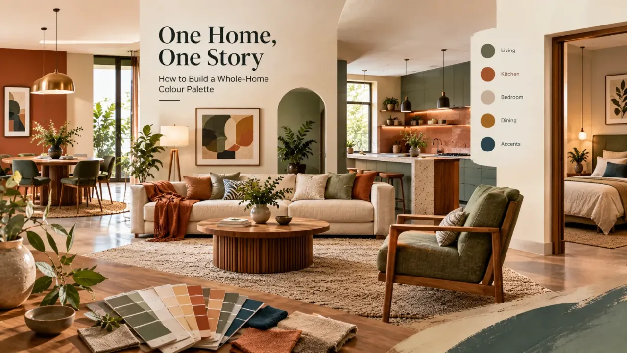
One Home, One Story: How to Build a Whole-Home Colour Palette
Choosing colours room by room sounds simple. You find a soft beige for the living room, a different colour for the bedroom, something bold for the dining area and perhaps another shade for the study.
Each room may look good on its own. Then you open the door to the entire home and something feels disconnected.
A successful whole-home colour palette is not about making every room the same colour. It is about creating a visual relationship between rooms, so the home feels layered, varied and still connected.
- What Is a Whole-Home Colour Palette?
- Why Room-by-Room Colour Selection Often Goes Wrong
- Start With the Elements You Cannot Easily Change
- Choose One Visual Direction First
- Build the Palette in Layers
- Think in Colour Families, Not Exact Shades
- Why Undertones Matter
- Choose a Bridge Colour
- Use Repetition to Create Continuity
- Why the Hallway Matters
- Planning Colour in Open-Plan Homes
- Give Closed Rooms More Personality
- Using the 60–30–10 Idea
- Materials Are Colours Too
- Use Wood Tones to Connect Rooms
- Use Metals as Visual Connectors
- Do Not Forget the Ceiling
- Let Colour Respond to Natural Light
- Create Softer Colour Transitions
- Common Whole-Home Palette Mistakes
- A Simple Whole-Home Palette Formula
- A Room-by-Room Example
- Build the Palette Around How You Live
- FAQ
What Is a Whole-Home Colour Palette?
A whole-home colour palette is a group of colours that work together across different rooms and spaces.
It gives the home a shared visual language.
That shared language can come from similar undertones, repeated accent colours, consistent wood tones, related neutral shades, repeated metal finishes, similar textile colours or one dominant colour family.
The rooms can still have different moods. The living room can be warm, the bedroom can be softer, the study can be deeper and the dining space can be more dramatic.
What connects them is not necessarily the exact same paint colour. It is the relationship between the colours.
Why Room-by-Room Colour Selection Often Goes Wrong
When each room is treated independently, there is a tendency to choose colours based only on that room.
A bedroom may be designed around a favourite blue. A living room around beige. A study around dark green. A dining room around terracotta.
Individually, all four may look attractive. But when you move through the home, the transitions can feel abrupt.
This happens because colour is not experienced in isolation. You see one room from another. You see a hallway while standing in the living room. You see the dining area from the kitchen.
Start With the Elements You Cannot Easily Change
Before selecting paint colours, look at the permanent or expensive elements already present in the home.
- Flooring
- Stone
- Tiles
- Kitchen finishes
- Wardrobes
- Woodwork
- Doors
- Window frames
- Countertops
- Large built-ins
- Existing furniture
These elements already contain colours and undertones. Your palette should work with them rather than fighting them.
Choose One Visual Direction Before Choosing Individual Colours
A palette becomes easier when you decide what overall feeling you want first.
Think beige, clay, walnut, olive and muted cream.
Use quiet neutrals, dusty colours and low-contrast combinations.
Build around deeper tones with carefully controlled contrast.
Use lighter background tones with restrained accents and natural materials.
The point is to establish the design direction before choosing individual paint shades.
Build the Palette in Layers
Instead of selecting ten unrelated colours, start with a simple hierarchy.
The colour family that appears most frequently across walls, larger furniture or major finishes.
Secondary colours that add variation while remaining related to the base.
Stronger colours used in smaller quantities through textiles, artwork or feature elements.
Wood, stone, metal, leather and fabrics that become part of the overall palette.
Think in Colour Families, Not Exact Paint Shades
One of the easiest ways to create continuity is to stay within related colour families.
A home does not need one beige everywhere. You can move through cream, sand, beige, taupe and mocha without making the rooms feel unrelated.
The same principle works with green, moving from sage to olive to moss to deeper green, or with blue, moving from powder blue to dusty blue to slate and navy.
The colours change, but the family creates continuity.
Why Undertones Matter More Than People Expect
Two colours can look similar on a paint card and completely different once they are inside a home.
Beige can lean pink, yellow, grey or green. White can feel warm or cool. Grey can contain blue, purple, beige or green.
If one room uses a warm beige and the adjoining room uses a blue-based grey, the transition may feel sharper than expected.
This is why a whole-home palette should be evaluated under the actual lighting conditions of the home.
Choose a “Bridge” Colour
A bridge colour is a shade that appears in more than one room and helps connect different spaces.
It does not need to dominate. It might appear through cushions, curtains, artwork, rugs, upholstery, joinery or accessories.
For example, a muted olive could appear in the living room through cushions, in the dining room through upholstery and in the bedroom through artwork.
The rooms remain different. The repeated colour quietly ties them together.
Use Repetition to Create Continuity
Colour does not have to be repeated in identical quantities to create a connection.
A colour may appear strongly in one room and only as a small detail in another.
This creates rhythm.
Dining Room — Olive dining chairs
Bedroom — Olive artwork
Study — Olive accessories
The colour appears multiple times, but never in exactly the same way. That is much more sophisticated than painting every room the same colour.
Why the Hallway Is Part of the Palette Too
Hallways are often forgotten because they are treated as circulation spaces. But they are actually one of the most important transitional elements in a home.
A hallway connects rooms that may each have different colours.
This makes it a useful place for a shared neutral, a quieter supporting tone, repeated wood, consistent artwork tones or a subtle accent colour.
Planning Colour in Open-Plan Homes
When the living room, dining area and kitchen share one large visual field, room-by-room colour decisions can create visual noise quickly.
Use the main neutral with the strongest expression of your accent colour.
Repeat the same palette through upholstery, artwork or a deeper supporting colour.
Let cabinetry, backsplash, stone and hardware connect visually with the living and dining areas.
Use quieter tones to prevent abrupt colour changes between functions.
The aim is not to make the spaces identical. It is to make them feel like parts of the same composition.
Give Closed Rooms More Personality
Bedrooms, studies and other private spaces give you more freedom because their doors can separate them visually.
This means you can introduce stronger variation while still keeping some connection with the rest of the home.
A neutral common area can lead to a muted blue bedroom. A warm beige living space can lead to a deeper olive study. A soft cream palette can lead to a richer burgundy-accented guest room.
The trick is to carry at least one relationship across the transition through undertone, wood, metal finish, accent colour or overall warmth.
Using the 60–30–10 Idea as a Guide
30% — Supporting colour or material family
10% — Accent colour
This does not mean you need to calculate the exact percentage of every colour in the house.
It simply reminds you not to give every colour equal importance. A home becomes easier to read when one or two colour families are clearly doing most of the visual work.
Materials Are Colours Too
A common mistake is to build a colour palette using paint alone.
But the colour of your floor, timber, marble, fabric, metal and cabinetry is just as important.
Even if the wall colour changes slightly from room to room, these materials can keep the visual language consistent.
Use Wood Tones to Connect Rooms
Wood is one of the strongest natural connectors in a home.
You do not necessarily need exactly the same wood finish everywhere. But completely unrelated wood tones can make the home feel fragmented.
Try establishing a small wood family and repeat one or two tones across furniture, doors or built-ins.
Use Metals as Visual Connectors Too
The same principle works with metal finishes.
Brass, antique gold, black, chrome and bronze each create a different visual language.
You do not have to use only one metal in the entire house. But repeating a dominant finish can make the interiors feel more intentional.
For example, antique brass can appear in lighting, cabinet handles, furniture details, bathroom accessories and decorative objects.
Do Not Forget the Ceiling
Ceilings are often treated as automatically white. Sometimes that is exactly right.
But when creating a whole-home palette, the ceiling can also influence how colour transitions work.
A soft warm white can connect multiple rooms without competing with their individual colours. A slightly tinted ceiling can add depth in a specific room.
The key is consistency of undertone rather than forcing every ceiling to have exactly the same treatment.
Let Colour Respond to Natural Light
The same colour can behave differently in different rooms.
Morning light is different from afternoon light. A room with large windows can display colour differently from a darker interior room. Artificial lighting changes the experience again at night.
This is why the palette should be tested in multiple conditions.
Create Softer Colour Transitions
A whole-home palette does not have to change abruptly at every doorway.
You can create softer transitions by using bridge colours and related neutrals.
The hallway acts as a soft bridge between the common area and bedroom.
Supporting neutrals hold the transition together even when the accent becomes stronger.
Common Whole-Home Palette Mistakes
- Choosing each room independently: Attractive rooms can still create a disconnected home when their colours have no relationship.
- Ignoring fixed finishes: Floors, stone, cabinetry and existing furniture already influence the palette.
- Ignoring undertones: Similar-looking colours can clash when their underlying temperature or tint is different.
- Using too many strong colours: Every room competing for attention can create visual noise.
- Using the exact same colour everywhere: Consistency does not require eliminating variation.
- Forgetting transitional areas: Hallways, passages, staircases and entryways are where colour relationships become especially visible.
A Simple Whole-Home Palette Formula
Step 2: Choose the overall mood of the home.
Step 3: Select one dominant colour family.
Step 4: Add two or three supporting families.
Step 5: Choose one or two accent colours.
Step 6: Select repeating wood and metal finishes.
Step 7: Assign different strengths of the palette to each room.
Step 8: Test the transitions between adjoining spaces.
A Room-by-Room Planning Example
Imagine you want a warm, contemporary home with a palette built around warm ivory, taupe, walnut, muted olive and antique brass.
Warm ivory + taupe + walnut + olive accents
Warm ivory + walnut + deeper olive
Warm ivory + taupe + walnut + brass
Soft ivory + taupe + olive textiles
A study could introduce deeper taupe with walnut and olive. A guest bedroom could use ivory, muted olive and warm wood.
Every room is different, but the home still tells one story.
Build the Palette Around How You Actually Live
A colour palette should respond to lifestyle too.
- A home with children may benefit from practical mid-tones and forgiving upholstery.
- A home with lots of natural light may support deeper colours.
- A darker apartment may benefit from lighter background tones.
- A formal home may support stronger contrast.
- A relaxed home may benefit from softer transitions.
The palette is not only about aesthetics. It also has to make sense for daily life.
Does the Home Feel Connected?
Once the colours are selected, forget the individual paint names for a moment.
Walk through the home mentally. Imagine entering, moving into the living room, looking toward the dining area, walking into the kitchen, turning into the hallway and opening the bedroom door.
Does the home feel like one continuous visual experience?
The rooms do not need to match.
The rooms simply need to relate.
Build Your Home's Colour Story With Confidence
Visualising your room before making major design decisions can help you explore colour direction, furniture placement and different interior styles.
Final Thought
A whole-home colour palette is not about forcing every room to look the same.
It is about creating enough repetition that the rooms feel connected, while allowing enough variation that each space still has its own character.
Start with the colours that already exist. Choose a clear overall mood. Build a dominant colour family. Add supporting tones, accents, materials and repeated details.
Then look at the home as one experience instead of a collection of individual rooms.
The best palette is often the one you do not consciously notice.
You simply move from room to room and feel that everything belongs together.
FAQ
A whole-home colour palette is a coordinated group of colours, materials and finishes that creates visual continuity across different rooms while still allowing each space to have its own character.
No. The goal is not to use one colour everywhere. Different rooms can use different shades or accents as long as they share visual relationships through colour families, undertones, materials or repeated details.
There is no fixed number, but a manageable palette usually works better than a collection of unrelated colours. Start with one dominant family, a few supporting tones and one or two controlled accents.
Yes. Flooring is one of the largest visual surfaces in a home and its colour and undertone can influence how wall colours, furniture and other finishes look.
Repeat selected colours, wood tones, metal finishes, textiles or undertones across rooms. A bridge colour used in smaller details can be especially effective.
Yes. In open-plan spaces, the colours should be planned as one larger composition so the different functional zones feel connected rather than visually competing.
Not necessarily. A hallway can act as a transition zone and use a quieter neutral or supporting shade that helps connect adjoining rooms.
Turn this idea into a plan for your home
Visualise your space, understand the likely budget, or find a professional who can bring the idea to life.