
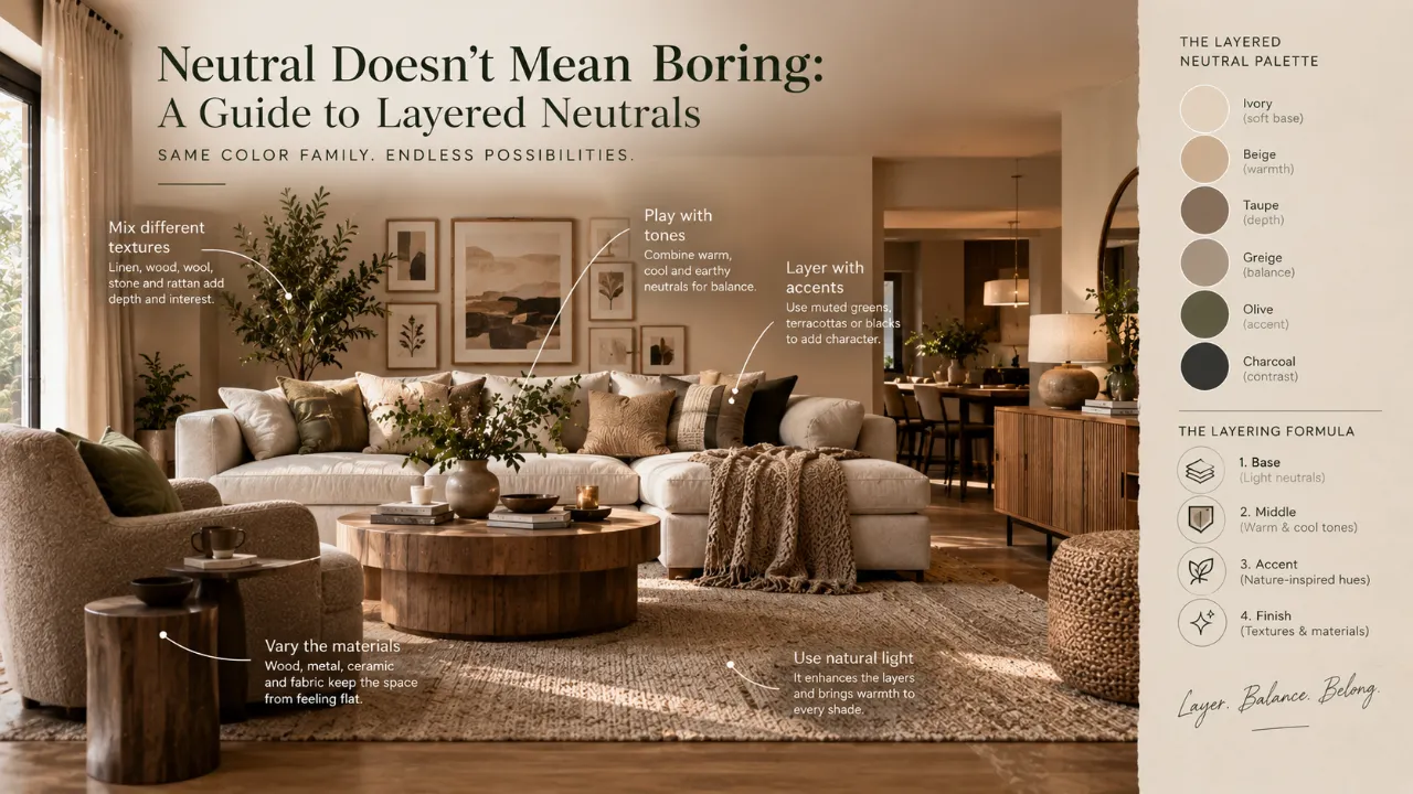
Neutral Doesn't Mean Boring: A Guide to Layered Neutrals
Neutral interiors are often associated with beige walls, cream sofas and a few carefully chosen accessories.
Done badly, that combination can feel flat. Done well, it can feel warm, sophisticated, calm and surprisingly rich.
The difference is rarely the number of colours in the room. It is how those colours, textures, materials, finishes, lighting and proportions work together.
A successful neutral interior is not simply a room where colour has been removed. It is a room where subtle variation takes the place of loud contrast. That is the idea behind layered neutrals.
Quick answer: Build a neutral interior using several related tones rather than one repeated shade. Combine light, mid and deep neutrals with different textures, materials, lighting and controlled contrast. The goal is to create depth while keeping the overall palette calm and connected.
- What layered neutrals actually mean
- Why neutral rooms can look boring
- How to choose a dominant neutral
- Understanding undertones
- Creating light, mid and deep layers
- Using texture and natural materials
- Working with warm and cool neutrals
- Using wood, rugs and curtains
- How lighting changes neutral interiors
- Adding contrast without bright colour
- Using artwork, plants and metallics
- Layered neutrals for Indian homes
- Common mistakes to avoid
- A simple neutral layering formula
- A practical checklist
- Frequently asked questions
What Are Layered Neutrals?
Layered neutrals means building a room around several related neutral tones rather than relying on one shade throughout.
Instead of using only one beige, you might combine warm white, ivory, cream, beige, taupe, greige, mushroom, camel, soft brown, stone and a controlled charcoal accent.
The colours remain visually related, but differences in undertone, depth and texture prevent the room from looking repetitive.
Why Do Neutral Rooms Sometimes Look Boring?
The problem is usually not neutrality itself. It happens when every element has almost the same visual quality.
A room can feel flat when it has the same beige on every wall, similar furniture tones, little texture, weak contrast and flat lighting.
When everything sits at the same visual level, the eye has very little to discover. Layering solves that problem.
1. Start With One Dominant Neutral
The easiest way to build a neutral palette is to choose one dominant base. This might be warm white, ivory, beige, taupe, greige or light stone.
This colour can establish the overall atmosphere of the room through walls, larger furniture or dominant architectural surfaces.
Once the base is established, the other neutrals can be selected around it.
Start simple: Choose one dominant neutral first. Then build supporting layers rather than selecting every shade at the same time.
2. Pay Attention to Undertones
Two colours can look almost identical in a catalogue and feel completely different in a real room because their undertones differ.
A white can lean warm, cool, yellow, pink or grey. A beige can also lean warmer, greyer or more yellow.
Before choosing several neutral finishes, compare them under the actual room's lighting.
3. Use Three Levels of Neutral
Light Neutral
Ivory, cream, warm white or pale beige for walls, ceilings, curtains and other background surfaces.
Mid Neutral
Taupe, greige, sand, mushroom or camel for larger furniture and supporting materials.
Deep Neutral
Espresso, deep brown, charcoal or dark bronze for controlled contrast and visual anchoring.
4. Texture Is What Keeps Neutrals Interesting
When colour is restrained, texture becomes more important.
A room containing a smooth painted wall, velvet sofa, woven rug, timber furniture, linen curtains and stone coffee table can remain almost completely neutral without feeling visually flat.
Texture can come through linen, cotton, wool, bouclé, wood grain, stone, cane, woven fibres, ribbed glass, brushed metal and textured plaster.
5. Do Not Make Every Surface Smooth
Too many polished surfaces can create a visually hard environment. Introducing tactile materials softens the composition.
A smooth stone surface can sit beside textured timber. A clean wall can sit behind a linen sofa. A polished table can be paired with a woven rug.
6. Warm and Cool Neutrals Can Work Together
Layering does not mean every neutral has to be warm. A carefully controlled combination of warm and cool neutrals can create sophistication.
For example, warm ivory walls can be paired with a soft greige sofa, cool stone, dark brown wood and brushed metal accents.
The key is proportion. One temperature should usually dominate while the other acts as a supporting layer.
7. Use Material Variation Instead of Constant Colour Changes
You do not have to introduce a new colour every time a room feels flat. Instead, change the material.
| Element | Possible Neutral Layer |
|---|---|
| Wall | Warm ivory or soft beige |
| Furniture | Taupe or greige upholstery |
| Floor | Natural wood or soft stone |
| Rug | Cream, beige or tonal pattern |
| Curtains | Warm white or light taupe |
| Accent | Dark wood, bronze or charcoal |
8. Wood Is One of the Easiest Ways to Warm Up Neutrals
Wood introduces both colour and texture.
Lighter timber can keep a neutral room airy. Medium wood can create warmth and balance. Dark wood can add contrast and depth.
You do not need many different wood tones. One consistent wood finish repeated through furniture, cabinetry or detailing can be enough.
9. Use Lighting to Reveal the Layers
A neutral room can look completely different under different lighting. This is why lighting should be treated as part of the colour palette.
Ambient
Provides the general illumination and establishes the room's overall brightness.
Task
Provides focused light for reading, working, cooking or other activities.
Accent
Highlights artwork, textures, shelves or architectural features.
Decorative
Adds character through selected lamps, pendants, sconces or fixtures.
10. Natural Light Can Change Neutral Colours
Neutral colours are highly sensitive to the light around them.
A room with strong daylight may make a warm neutral appear brighter, while a darker room may make the same shade appear deeper.
This is why paint, fabric and finish samples should ideally be tested in the actual room rather than selected entirely from photographs or showroom lighting.
11. Add Contrast Without Adding Bright Colour
A neutral room still needs some contrast, but that contrast does not have to come from bright colour.
Black, espresso, dark bronze, deep wood and charcoal can all provide definition while keeping the overall palette understated.
12. Use Metallics as Small Highlights
Brass, bronze, chrome, blackened metal and brushed finishes can work beautifully within neutral interiors.
Use them selectively and repeat the chosen finish across a few locations so it feels intentional.
13. Let Furniture Create the Layering
Furniture does not have to match exactly.
A neutral living room can combine a cream sofa, taupe chair, dark wood table, stone coffee table and woven ottoman.
The colours remain related while the different forms and materials create visual interest.
14. Rugs Are Essential in Neutral Interiors
A rug can introduce colour, texture, pattern, warmth and scale at the same time.
A neutral room does not necessarily need a plain rug. Subtle geometric patterns, tonal variations and woven textures can add depth without making the room colourful.
15. Curtains Can Add Another Neutral Layer
Curtains can create subtle depth when their tone differs slightly from the wall.
For example, warm white walls, cream curtains and a taupe sofa can create visual variation while keeping the entire palette quiet.
16. Use Artwork to Prevent a Neutral Room From Feeling Generic
A neutral palette does not mean the walls need to remain visually empty.
Black-and-white photography, muted abstracts, earthy compositions, line drawings and monochromatic artwork can all add contrast and personality.
17. Plants Add a Different Kind of Contrast
Greenery introduces organic colour, texture, shape, height and movement without requiring a major change to the palette.
A few well-placed plants can make a neutral interior feel more alive without overwhelming its calm character.
18. Use Repetition to Make Neutral Layers Feel Intentional
Layering works best when certain elements repeat.
- Repeat wood tones across furniture and cabinetry.
- Repeat taupe through curtains and cushions.
- Repeat brass through lighting and hardware.
- Repeat stone through tabletops and selected accessories.
Repetition creates visual rhythm and prevents different neutral elements from looking like unrelated purchases.
19. Do Not Make Everything Beige
A neutral palette can include many colours that are not beige.
Ivory, mushroom, greige, warm grey, camel, brown, stone and charcoal can all participate in a neutral scheme.
The point is not to find one perfect beige. The point is to create a family of related colours.
20. Neutral Does Not Mean No Colour
Muted green, dusty blue, clay, terracotta, blush, olive and soft ochre can sometimes act as supporting colours within a neutral interior.
The question is not whether a colour is technically neutral. The question is whether it supports the overall visual balance.
21. How to Layer Neutrals in a Living Room
| Layer | Example |
|---|---|
| Walls | Warm ivory |
| Sofa | Soft beige |
| Accent chair | Taupe or greige |
| Rug | Cream with subtle texture |
| Coffee table | Natural wood or stone |
| Curtains | Warm off-white |
| Cushions | Beige, camel and muted brown |
| Accent | Dark bronze or charcoal |
| Greenery | Natural green |
22. How to Layer Neutrals in a Bedroom
Bedrooms benefit from softness.
Consider warm off-white walls, a taupe or beige headboard, cream bedding, a textured throw, natural wood bedside tables, linen curtains, soft brown accents and warm bedside lighting.
23. How to Layer Neutrals in a Modern Indian Home
Neutral palettes can provide a calm foundation for materials, craftsmanship and cultural details in Indian homes.
Wood, stone, brass, cane, woven textiles and handcrafted accessories can introduce warmth and character.
Indian-inspired artwork or traditional decorative pieces can also be incorporated without overwhelming the neutral base.
24. Use Proportion, Not Just Colour
A neutral palette can still fail if the proportions are wrong.
Think about scale, height, visual weight, spacing and repetition alongside colour.
Too many small decorative objects can make a room feel busy even when every object is beige or cream.
25. Neutral Interiors Need Visual Anchors
Every room benefits from something that gives the eye a place to land.
Dark Furniture
A deeper sofa, chair, table or cabinet can anchor a light neutral room.
Statement Light
A distinctive fixture can create hierarchy without introducing a strong colour.
Artwork
A large artwork composition can provide scale and visual focus.
Natural Element
A large plant or natural material can add organic contrast.
26. Common Mistakes With Layered Neutrals
Using Only One Neutral
A single colour repeated everywhere can flatten the room.
Ignoring Undertones
Warm and cool neutrals can clash when selected without testing them together.
Using Too Many Finishes
Layering does not mean adding a different material everywhere.
Making Everything Match
Perfectly matching furniture can make the interior feel manufactured.
Forgetting Lighting
The right palette can still look dull under flat or poorly positioned lighting.
Removing All Contrast
A room with no darker or stronger visual element can lack definition.
Buying Everything at Once
Neutral rooms often benefit from gradual layering rather than filling every surface immediately.
27. A Simple Layering Formula
| Layer | Suggested Role | Examples |
|---|---|---|
| 60% Dominant Neutral | Main background | Walls, large furniture, major surfaces |
| 30% Supporting Neutral | Secondary layers | Curtains, rugs, secondary furniture, larger accessories |
| 10% Contrast & Accents | Visual definition | Dark wood, metal, artwork, greenery or muted colour |
This is a starting framework rather than a strict rule. The proportions can change depending on room size, natural light and personal taste.
28. A Neutral Design Checklist
Before finalising the room, ask:
Is there more than one neutral tone? Have I checked the undertones? Is there enough texture? Are there contrasting materials? Is there a darker anchor? Does the lighting reveal the different layers? Are the furniture proportions appropriate? Are some elements repeated for cohesion? Does the room have personality? Is there enough visual breathing space? Does the palette work in both daylight and evening light?
The Difference Is in the Layers
Neutral interiors do not become interesting because they contain more decoration. They become interesting because they contain more relationships.
A warm wall interacts with a cooler fabric. Smooth stone sits beside textured wood. Soft upholstery meets a woven rug. Light neutrals are balanced with darker accents. Natural light changes how the palette reads throughout the day.
That is what layering does.
Discover Your Ideal Interior Direction
Explore your preferred style, visualise your room and connect your colour and material choices with a practical interior plan.
Find Your Interior Style Design My Room with AI Explore Interior DesignersFrequently Asked Questions
What are layered neutrals in interior design?
Layered neutrals means combining several related neutral tones, textures, materials and finishes instead of relying on one neutral colour throughout the room.
How do I make a neutral room look less boring?
Add variation through texture, natural materials, different neutral tones, lighting, furniture shapes, artwork and controlled contrast rather than simply adding more bright colours.
How many neutral colours should I use?
There is no fixed number. A useful starting point is one dominant neutral supported by one or two lighter or darker neutrals and a small amount of contrast.
Can beige and grey work together?
Yes. Beige and grey can work together when their undertones, proportions and surrounding materials are coordinated.
How do I add contrast to a neutral interior?
Use deeper neutrals such as charcoal, espresso, dark wood or bronze, or introduce muted accent colours in small amounts.
Does a neutral interior have to be minimalist?
No. Neutral interiors can be modern, traditional, luxury, contemporary, eclectic or layered with decorative elements.
What materials work well in a neutral interior?
Wood, stone, linen, cotton, wool, woven materials, cane, textured plaster and selected metals can all add depth to a neutral palette.
Can neutral interiors work in Indian homes?
Yes. Neutral palettes can provide a calm base for wood, stone, brass, woven textiles, artwork and handcrafted elements while allowing regional and personal details to stand out.
Final Takeaway
Neutral does not mean boring. It means the details have to do more of the talking.
Layer different neutral tones, pay attention to undertones, introduce texture, vary materials, use thoughtful lighting and create enough contrast to give the room a visual anchor.
When those elements work together, a neutral interior can feel calm without feeling empty, sophisticated without feeling cold and refined without becoming repetitive.
The secret to a beautiful neutral room is not more colour. It is better layering.
Turn this idea into a plan for your home
Visualise your space, understand the likely budget, or find a professional who can bring the idea to life.