
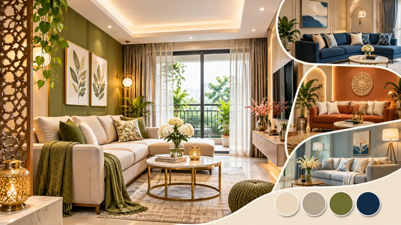
Living Room Colour Combinations for Indian Homes
Choosing colours for a living room is not simply about selecting a shade that looks attractive on a paint card. The colours need to work with the room's natural light, flooring, furniture, wall finishes and the way the space is used every day.
Indian homes also have varied conditions. A living room may receive strong afternoon sunlight, have limited daylight, open into a dining area or include existing wooden furniture that cannot easily be replaced. A colour combination that looks beautiful in one home may feel completely different in another.
The best approach is to build a palette around the room's existing features and then introduce contrast through furniture, textiles and smaller accents.
Here are ten living room colour combinations that can work beautifully in Indian homes, along with practical advice on how to use them.
1. Ivory, Sage Green and Natural Wood
Ivory and sage green create a relaxed combination that feels fresh without appearing too stark. Natural wood adds warmth and prevents the palette from looking flat.
How to use it:
- Keep the main walls ivory or soft off-white.
- Introduce sage green through a sofa, accent chairs or cushions.
- Use light oak or natural wood for the TV console and side tables.
- Add a few indoor plants to connect the colours.
Works well for: Contemporary apartments, open-plan living rooms and homes that receive good natural light.
2. Greige, Walnut Brown and Soft White
Greige combines the softness of grey with the warmth of beige. When paired with walnut brown and soft white, it creates a balanced and understated living room.
How to use it:
- Use a light greige on the main walls.
- Choose walnut for the TV unit, coffee table or shelving.
- Keep larger upholstered furniture in soft white, cream or light beige.
- Add darker details through frames, handles or lighting fixtures.
Works well for: Homes with existing wooden furniture and people who prefer a timeless, understated look.
3. Warm Beige, Terracotta and Cream
Beige and cream create a soft foundation, while terracotta adds character. This combination brings an earthy quality to the living room without requiring a strong colour across every wall.
How to use it:
- Use cream or light beige as the dominant wall colour.
- Introduce terracotta through cushions, pottery, artwork or a single accent chair.
- Choose light or medium wood finishes.
- Keep larger surfaces relatively simple.
Works well for: Homes that favour natural materials, earthy styling and a relaxed atmosphere.
4. Off-White, Navy Blue and Brass
Off-white provides a bright base, while navy blue creates a strong focal point. Brass adds a subtle metallic detail that makes the combination feel more considered.
How to use it:
- Keep the main walls off-white.
- Introduce navy through the sofa, accent chairs or selected upholstery.
- Use brass in lamps, handles or small decorative details.
- Balance the darker blue with light curtains and flooring.
Works well for: Larger living rooms, rooms with good daylight and homeowners who want a more defined colour statement.
5. Muted Olive, Stone Grey and Light Oak
Muted olive creates a connection with nature, while stone grey gives the room a contemporary base. Light oak prevents the combination from becoming too cool.
How to use it:
- Use stone grey or a soft neutral for the main walls.
- Introduce muted olive on one wall or through upholstery.
- Pair it with light oak furniture.
- Keep accessories simple and use a limited number of contrasting colours.
Works well for: Contemporary homes, minimal interiors and living rooms that need a little colour without becoming visually busy.
6. Powder Blue, Soft White and Light Grey
Powder blue can make a living room feel light and calm. Soft white and light grey help maintain the airy quality of the palette.
How to use it:
- Use soft white for most walls.
- Introduce powder blue through an accent wall, cushions or an upholstered chair.
- Use light grey for rugs or selected furniture.
- Choose simple finishes to keep the overall appearance clean.
Works well for: Smaller living rooms, bright apartments and spaces where a cooler palette is preferred.
7. Taupe, Deep Burgundy and Antique Gold
Taupe provides a muted background for deep burgundy, while antique gold introduces a restrained decorative accent. This combination can create a rich living room without relying on excessive ornamentation.
How to use it:
- Keep the main walls in light taupe.
- Introduce burgundy through a sofa, accent chair or cushions.
- Use antique gold sparingly in lighting and accessories.
- Balance the deeper colours with cream upholstery or lighter flooring.
Works well for: Larger living rooms, formal sitting areas and interiors that call for a richer appearance.
8. Soft Yellow, Warm Grey and Natural Oak
A muted yellow can introduce brightness without feeling overly bold. Warm grey keeps the palette grounded, while natural oak adds a consistent wood tone.
How to use it:
- Choose a pale, muted yellow rather than a highly saturated shade.
- Use warm grey for the sofa or selected wall sections.
- Add natural oak through tables and storage.
- Keep white or ivory in the curtains and ceiling.
Works well for: Living rooms that need a little visual warmth, particularly when daylight is limited.
9. Charcoal, Off-White and Brass
Charcoal creates depth and contrast, while off-white keeps the room from feeling too dark. Brass details can introduce a small amount of visual warmth.
How to use it:
- Use charcoal on a selected wall rather than automatically applying it everywhere.
- Keep larger furniture pieces off-white or light grey.
- Introduce brass through lighting and small accessories.
- Ensure the room has adequate daylight and layered artificial lighting.
Works well for: Well-lit living rooms and homeowners who prefer a contemporary, high-contrast look.
10. Dusty Rose, Mushroom Beige and Soft Brown
Dusty rose can introduce a subtle colour accent without appearing overly bright. Mushroom beige and soft brown make the combination feel balanced and mature.
How to use it:
- Use mushroom beige for the main walls.
- Introduce dusty rose through cushions, upholstery or artwork.
- Choose soft brown for wooden furniture and decorative details.
- Keep the remaining finishes understated.
Works well for: Smaller sitting areas, apartments and homeowners who want a softer alternative to conventional beige interiors.
11. How to Choose the Right Colour Combination for Your Living Room
A palette should be selected according to the room rather than copied directly from an inspiration image.
Consider the Direction and Amount of Natural Light
Observe the room at different times of the day. A living room receiving strong sunlight may handle cooler or deeper colours differently from one that remains shaded for most of the day.
A darker room may benefit from lighter wall colours and reflective finishes. However, do not assume that every small or dim room needs pure white. Soft ivory, pale greige and muted shades can also work.
Match the Colours With Existing Flooring
Flooring occupies a large visual area, so it should be considered before finalising wall colours.
- Beige or cream tiles can work with sage, olive, terracotta and walnut.
- Grey flooring often pairs well with off-white, muted blue and natural wood.
- Dark wooden flooring can be balanced with lighter walls and upholstery.
- Patterned flooring may require a simpler wall palette.
Consider the Undertone of the Paint
Two shades that appear similar on a colour card can look noticeably different when applied to a wall.
Beige may have yellow, pink or grey undertones. White can appear cool, neutral or warm. Grey may lean towards blue, green or brown.
Look at the paint sample beside the flooring, furniture and curtains before making a decision.
Coordinate the Walls With Furniture
If you already own a sofa, TV unit or wooden furniture, use those pieces as part of the colour plan.
The wall colour should support the existing furniture rather than compete with it. For example, walnut furniture can work with greige, ivory and muted green, while a navy sofa may look balanced against off-white or pale grey walls.
Test Colours Before Painting the Entire Room
Paint a sample on the wall and observe it in morning, afternoon and evening light. Check it beside the actual furniture and flooring.
Do not rely only on a digital colour preview or a small paint card. The final appearance depends on lighting, surface texture and the surrounding finishes.
12. Common Colour Selection Mistakes to Avoid
- Choosing colours only from online pictures: The original room may have different lighting, flooring and furniture.
- Using too many accent colours: Too many strong shades can make the living room feel disconnected.
- Ignoring wood undertones: Furniture with competing wood tones can make an otherwise balanced palette look inconsistent.
- Selecting paint before checking flooring: The two may clash once installed together.
- Using dark shades without considering lighting: Deep colours need suitable natural and artificial light.
- Making every wall a feature wall: Strong colours and finishes need visual breathing space.
- Skipping sample tests: A colour can look very different across a large wall.
Final Thoughts
The right living room colour combination is one that works with your home rather than simply following a trend. Whether you prefer ivory and sage, navy and off-white, earthy terracotta or a deeper burgundy palette, the key is to balance the main wall colour with furniture, flooring, wood finishes and lighting.
Start with the elements that are difficult to change, test your shortlisted shades in the actual room and introduce stronger colours where they have the most impact. A thoughtfully planned palette can make an Indian living room feel cohesive, comfortable and personal.
Explore More With Walls to Wonder
Use Walls to Wonder's AI tools to explore living room colour ideas, visualise design possibilities and plan your interiors.
- Design My Room – Explore different wall colours, furniture combinations and design possibilities for your living room.
- Whole Home Visualizer – Visualise how your living room palette can coordinate with the rest of your home.
- Interior Design Cost Estimate – Get an indicative estimate to help plan your interior design budget.
- Interior Quotation Checker – Review an interior design quotation and understand the listed costs and scope.
- Rate My Room Design – Get feedback on your living room design and identify possible improvements.
- Interior Style Finder – Explore interior styles that match your preferences and home.
Explore more at Walls to Wonder.
Frequently Asked Questions
1. Which colour combination is best for an Indian living room?
Ivory with sage green, greige with walnut, and beige with terracotta are versatile combinations. The best choice depends on the room's natural light, furniture, flooring and personal preference.
2. Which colours make a small living room look bigger?
Soft white, ivory, pale greige and light grey can help a small living room feel brighter. Using similar tones across walls and larger furniture pieces can also create a more continuous appearance.
3. Which wall colour goes well with wooden furniture?
Greige, ivory, soft white, muted sage and warm beige can pair well with wooden furniture. The exact shade should be selected according to whether the wood has warm, neutral or cooler undertones.
4. Are dark colours suitable for Indian living rooms?
Yes. Navy, charcoal, olive and burgundy can work well when balanced with lighter surfaces and suitable lighting. They can be used on selected walls, furniture or accessories.
5. Should all living room walls have the same colour?
Not necessarily. A single wall colour creates a simple, cohesive look, while a carefully selected accent wall can add depth. The decision should depend on the room's proportions and existing finishes.
6. How can I test a living room colour combination before painting?
Use paint samples on the actual walls and observe them at different times of day. Check how they look beside your flooring, curtains and furniture before finalising the shades.
Turn this idea into a plan for your home
Visualise your space, understand the likely budget, or find a professional who can bring the idea to life.