
Colours That Hide Stains and Dust in Everyday Rooms
A beautiful home does not have to look spotless every minute of the day. In a busy household, dust settles on furniture, fingerprints appear near switches, food splashes happen in the kitchen, and sofas collect the occasional mark. The real challenge is choosing finishes that continue to look good between regular cleaning sessions.
Colour can make a meaningful difference. Bright white surfaces may reveal certain marks quickly, while very dark finishes can highlight pale dust, lint and fingerprints. A carefully chosen mid-tone, a textured fabric or a forgiving pattern can make everyday imperfections less noticeable.
The trick is not to choose colours that hide everything. It is to create a home that looks inviting, suits your style and is practical to maintain.
Here is how to choose colours for living rooms, kitchens, hallways, flooring and other daily-use spaces without compromising on design.
Why the Right Colour Helps, but Isn't Magic
Dust and stains become noticeable partly because they contrast with the surface underneath. White dust stands out on a dark table, while dark marks may be obvious on a pale wall. Fingerprints can also appear more prominently on glossy, uniform finishes.
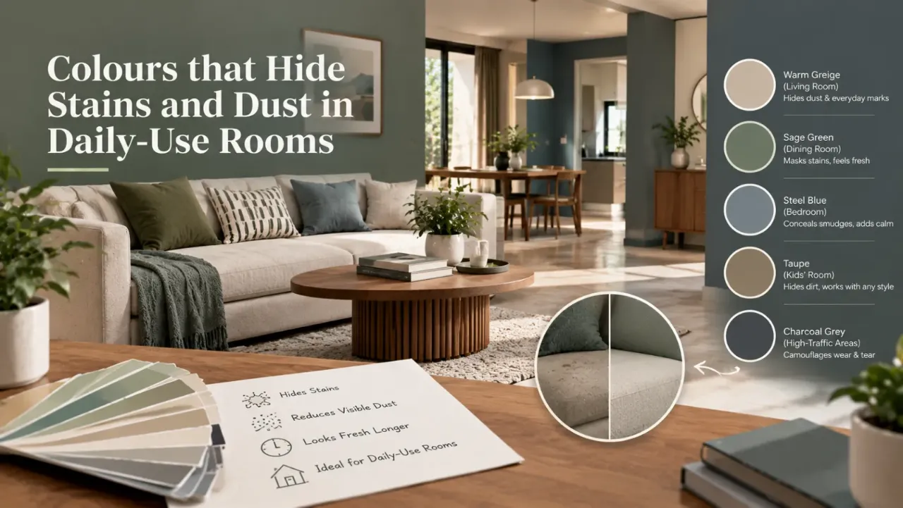
Mid-tones and visually varied surfaces can reduce the contrast of some everyday marks. Warm greige, taupe, mushroom, muted sage and medium wood tones are useful starting points because they bring depth without relying on very light or very dark colours.
However, the effect depends on the type of dirt, the material, the lighting and the finish. Colour alone will not make a surface stain-resistant or eliminate the need for cleaning.
1. Choose Warm Greige, Taupe and Mid-Tone Neutrals for Walls
For frequently used spaces, mid-tone neutrals can be easier to live with than stark white or extremely dark walls.
Warm greige combines grey and beige. Taupe has a soft brown-grey character, while mushroom and stone shades create a gentle, earthy backdrop. These colours work well with natural wood, cream upholstery, muted greens and a wide range of furnishings.
They can be particularly useful in living rooms, family rooms and corridors where minor contact marks may develop over time.
Colours worth considering:
- Warm greige: A balanced neutral that works with wood, beige and muted green.
- Taupe: Adds warmth and depth without becoming too dark.
- Mushroom beige: Creates a soft, understated background for everyday living.
- Muted sage: Introduces colour while remaining calm and versatile.
- Medium stone grey: Can suit contemporary spaces when balanced with warm lighting and softer textures.
Before choosing, consider where the wall receives direct sunlight, which areas people touch most often and how the shade appears under artificial lighting.
A colour that looks like a gentle beige in a showroom may appear much cooler or darker in your home. Test a sample before painting the entire room.
2. Pick Sofa and Upholstery Colours That Handle Everyday Use
Sofas, dining chairs and upholstered headboards receive frequent contact. Body oils, food spills, pet hair and fabric lint can be more noticeable on some upholstery colours than others.
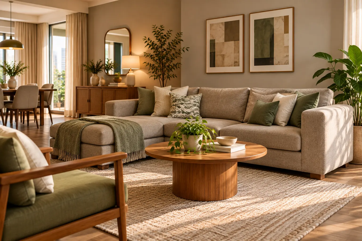
For everyday seating, consider textured mid-tone fabrics in taupe, warm grey, mushroom, olive or a mixed beige-and-grey weave. Subtle patterns and heathered fabrics blend different tones together, making small variations less obvious than on a completely uniform surface.
What works well:
- Textured woven upholstery rather than an entirely flat, visually uniform fabric.
- Mid-tone shades that coordinate with the flooring and walls.
- Subtle patterns that are not so busy that the room feels cluttered.
- Removable, washable covers where the fabric and care instructions allow.
- Upholstery with a documented cleaning method appropriate to the household's needs.
Cream and ivory sofas can look beautiful, but they may require more frequent attention in homes with young children, pets or heavy daily use. Very dark upholstery can show pale lint and dust more clearly.
The best colour is not necessarily the darkest one. It is the shade and fabric that suit your household and can be cleaned without damage.
3. Select Flooring That Doesn't Show Every Speck
Flooring covers a large area, so its colour and finish influence both the room's appearance and the visibility of everyday debris.
Very dark, glossy floors may highlight light-coloured dust, footprints and fine scratches. Very pale, uniform surfaces may make darker particles and certain marks easier to spot. Mid-tone wood, softly patterned stone and surfaces with natural colour variation can provide a practical balance.
Consider these options:
- Medium oak and natural wood tones: Add warmth and often work well with dust, beige walls and earthy furniture colours.
- Warm grey or greige tiles: Create a contemporary foundation that coordinates with varied palettes.
- Subtly patterned stone-look finishes: Introduce colour variation that can make small marks less conspicuous.
- Textured or low-sheen finishes: May reduce the visibility of some smudges and reflections, depending on the surface.
Grout colour matters too. A sharp contrast between tiles and grout can make ordinary discolouration more noticeable. Choose grout based on the tile, cleaning requirements and manufacturer's recommendations.
In kitchens and bathrooms, safety, slip resistance, moisture suitability and ease of cleaning matter more than camouflage alone. Never select a flooring finish purely because it appears to hide dirt.
4. Use Practical Colours in Kitchens and Dining Areas
Kitchens experience oil splashes, food stains, water marks and repeated handling around cabinet doors and drawers. Dining areas face spills and frequent contact around tables and chairs.
For kitchen cabinetry, warm grey, muted sage, taupe, mushroom and medium wood tones can provide a balanced alternative to completely white or very dark finishes.
For backsplashes and countertops, subtle variation in colour and pattern may make minor everyday marks less prominent than a perfectly uniform surface. But the material's porosity, sealing, heat resistance and cleaning requirements must also be considered.
Useful design choices include:
- Mid-tone cabinet colours that coordinate with the floor and countertop.
- Easy-to-clean surfaces in areas directly behind cooking and preparation zones.
- Cabinet handles or finishes that are practical for frequent touching.
- A coordinated grout shade for tiled backsplashes.
- Worktop materials suited to the actual cooking habits of the household.
A pale kitchen can still be practical with suitable materials and maintenance. A dark kitchen can also look striking, but some dark glossy cabinets and countertops reveal fingerprints and dust very easily.
5. Make Entryways and Hallways More Forgiving
Entryways and corridors often receive more contact than expected. Shoes, bags, luggage, children and daily movement can leave scuffs along walls and near door frames.
A practical mid-tone wall colour—such as warm greige, taupe or muted stone—can make small variations less conspicuous. You can also use a slightly deeper shade on a particularly vulnerable lower section of the wall, provided it works with the overall design.
Choose the paint finish according to the manufacturer's cleaning guidance. A washable coating may be more valuable than a supposedly forgiving colour that cannot tolerate wiping.
Other useful choices include:
- A properly sized doormat to reduce tracked-in dust.
- Storage that keeps shoes and bags from scraping against walls.
- Durable finishes near corners and high-contact areas.
- A coordinated runner, where appropriate for safe movement and easy cleaning.
A beautiful hallway starts with managing the causes of dirt as well as choosing a colour that disguises minor marks.
6. Remember That Finish and Texture Matter as Much as Colour
Colour is only one part of the decision. The surface finish affects how a material reflects light, responds to touch and handles cleaning.
On walls, some flat or matte paints help soften the appearance of small surface irregularities and reduce glare. However, not every matte paint is equally washable. A suitable washable matte product may be a good fit for a living room, while a higher-contact area may need a coating designed for easier cleaning.
Satin or semi-gloss finishes can be easier to wipe in appropriate applications, but they may also reveal surface imperfections or create stronger reflections.
For fabrics, texture and mixed fibres can break up visual uniformity. For wood and tiles, grain, veining and subtle colour variation can help make minor dust or marks less prominent.
Before selecting any finish, check three things:
- Whether it is suitable for the room and substrate.
- Whether it tolerates the cleaning routine you expect to use.
- Whether its sheen and texture look good under your actual lighting.
For kitchens, bathrooms and other moisture-prone spaces, follow the manufacturer's instructions for the required paint or material system.
7. Build a Practical Colour Palette Instead of Matching Everything
A home can look coordinated without every surface having the same colour.
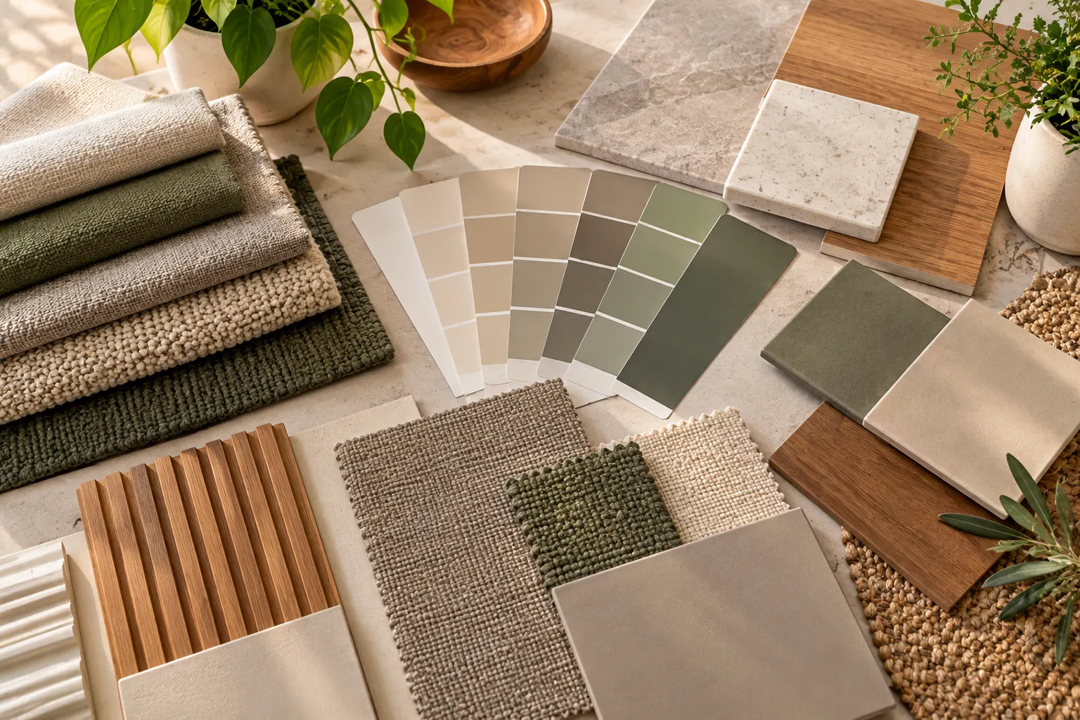
Start with a main neutral for the larger surfaces, such as warm greige or mushroom. Add medium wood for warmth, then introduce an accent such as sage or olive through cushions, curtains, cabinet fronts or smaller decorative elements.
Use different materials to create interest. A textured taupe sofa, a warm grey wall, wood furniture and a subtly patterned rug may work together more effectively than four perfectly matching flat surfaces.
Think about the transition from one space to the next, especially in open-plan homes. The living room, dining area and hallway can share related undertones while still having their own character.
Before committing to the palette, place your paint samples beside the actual flooring, upholstery and countertop materials. View them in morning daylight and evening lighting.
The goal is a coordinated home that feels comfortable and stays practical—not a single shade repeated everywhere.
8. Common Colour Mistakes to Avoid
Bright white can reveal some marks quickly. Use it where it suits the design, but select washable finishes and consider warmer alternatives for high-contact areas.
Dark glossy furniture and finishes may show light dust, lint and fingerprints. Consider mid-tones or textures where frequent contact is expected.
A forgiving shade will not compensate for a surface that stains easily or cannot be cleaned properly.
Daylight and artificial lighting can change how a colour appears and how much surface dust or texture is visible.
Paints and fabrics differ in durability and cleaning requirements. Read the manufacturer's care guidance before purchasing.
A colour card cannot show exactly how a full wall or sofa will look beside your actual floor, windows and furniture.
9. A Quick Room-by-Room Colour Guide
| Daily-use area | Colours to consider | Practical detail |
|---|---|---|
| Living room | Warm greige, taupe, mushroom, muted sage | Textured upholstery and washable wall finishes |
| Kitchen | Warm grey, muted sage, medium wood | Cleanable backsplash, practical countertop and cabinet finish |
| Hallway and entrance | Mid-tone beige, greige, stone | Washable wall coating and protection around corners |
| Dining area | Taupe, earthy beige, medium wood | Upholstery suited to frequent use and easy-to-maintain surfaces |
| Family room | Warm grey, olive, mixed neutral fabrics | Removable covers where suitable and durable finishes |
| Flooring | Medium wood, warm grey, subtly varied stone | Consider slip resistance, grout care and cleaning requirements |
These are starting points rather than fixed rules. Household routines, natural light, pets, children, material quality and cleaning habits all influence the best choice.
10. Test Before You Commit
Before painting a whole room or ordering a large sofa, test your shortlisted colours in the actual space.
Apply paint samples to small areas of the wall and view them at different times of day. Place fabric samples on the sofa or near the dining chairs. Compare flooring samples beside the cabinetry and wall paint.
Ask the supplier how the finish should be cleaned, which products are suitable and whether a stain-protection treatment is appropriate for the material.
Also remember that a colour that makes dust less noticeable may not conceal an oily stain, and a stain that looks faint from across the room may still need prompt cleaning.
The purpose is to make everyday maintenance easier—not to ignore dirt or postpone necessary care.
Plan Your Everyday-Friendly Interior Palette
Choosing practical colours is easier when you can compare them within the context of your actual room.
Use the Walls to Wonder Design My Room tool to explore colour directions for a room photograph. The Whole Home Visualizer can help you coordinate a consistent palette across connected spaces.
You can also use the Interior Design Cost Estimator to plan the budget for paint, finishes and other upgrades, or explore the Walls to Wonder designers directory for professional design support.
Final Thought
The most practical home colours are not always the palest or the darkest. Mid-tone neutrals, muted greens, natural wood and subtly textured materials can help everyday dust and minor marks blend into the room while keeping the design warm and inviting.
Choose colours in relation to the material, the lighting and the way each space is used. Pair them with finishes that suit the required cleaning routine, and test samples before making a large commitment.
A well-designed home should look beautiful in photographs, but it should also feel comfortable to live in every day.
Frequently Asked Questions
1. Which wall colours hide dust and minor marks best?
Warm greige, taupe, mushroom, muted sage and medium stone shades are useful starting points because they can reduce the contrast of some everyday marks. The result depends on the type of dust, the lighting and the wall finish.
2. Do dark colours hide stains better than light colours?
Not necessarily. Dark surfaces can make pale dust, lint and fingerprints more visible, while light surfaces may show dark marks. Mid-tone colours and subtle texture can offer a useful balance.
3. What sofa colours are practical for a busy household?
Taupe, warm grey, mushroom, olive and mixed neutral fabrics can be practical options. Choose upholstery based on its cleaning instructions, durability, texture and the needs of your household—not colour alone.
4. Which paint finish is easiest to maintain?
It depends on the product and the surface. Washable matte paints can suit many living areas, while some higher-sheen finishes are easier to wipe but may reveal surface imperfections. Check the manufacturer's specifications before choosing.
5. What flooring colour is best for hiding everyday dust?
Medium wood tones, warm greys and subtly patterned stone-look flooring can make some everyday dust and minor marks less conspicuous. Also consider slip resistance, scratch visibility, grout maintenance and the floor's cleaning requirements.
Turn this idea into a plan for your home
Visualise your space, understand the likely budget, or find a professional who can bring the idea to life.