
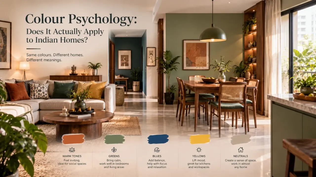
Colour psychology: does it actually apply to Indian homes
“Blue is calming.” “Yellow makes you happy.” “Red adds energy.” You have probably heard versions of these statements countless times. And there is some truth behind them. But the way colour works in a real home is much more complicated. The same blue can make one room feel calm and another feel cold. A warm yellow can feel cheerful in one setting and overwhelming in another. So does colour psychology actually apply to Indian homes? Yes—but not as a fixed dictionary of colours and emotions. Colour interacts with light, room function, surrounding materials, cultural associations, personal memories and the other colours around it.
Colour psychology can be useful in Indian homes, but it should not be treated as a universal formula. The effect of a colour depends on its shade, saturation, lighting, surrounding materials, room function, cultural context and the personal preferences of the people who live there.
- Colour Does Influence How We Experience a Space
- Why Indian Homes Need a More Contextual Approach
- The Biggest Mistake: Treating Colour Like a Formula
- Light Can Change the Colour You Think You Chose
- Room Function Matters More Than Colour Rules
- Blue Does Not Always Mean Calm
- The Same Is True for Red
- What About Green?
- Indian Homes Add Another Layer: Cultural Meaning
- What About Vastu?
- Personal Preference Can Beat the “Correct” Colour
- The Colours Around a Colour Matter Too
- Texture Can Change How Colour Feels
- Neutral Colours Are Not Emotionless
- A Better Way to Choose Colour for an Indian Home
- Test the Colour in the Actual Room
- Final Thought
- FAQ
Colour Does Influence How We Experience a Space
People do associate colours with emotions and qualities, but those relationships are not one-to-one. A colour can be linked with several different emotions, and the strength of the association can vary.
That matters enormously in interior design. Instead of asking, “Is green calming?” ask, “What kind of green, in what room, under what light, alongside which materials, for which person?”
Think of colour psychology as a starting point for design decisions, not as a final answer.
Why Indian Homes Need a More Contextual Approach
Colour does not enter a home as an isolated paint swatch. It arrives with the architecture. It sits next to flooring, wood, stone, metal, textiles and furniture. It changes under daylight. It looks different in the evening. It can carry cultural meaning. And it interacts with the way a particular family uses a room.
A colour that looks perfectly balanced in a minimalist showroom can feel completely different when placed alongside patterned upholstery, dark wood or a collection of traditional objects.
Colour is never experienced alone.
The Biggest Mistake: Treating Colour Like a Formula
Imagine a simple chart: blue equals calm, yellow equals happiness, red equals energy, green equals nature and purple equals luxury.
It sounds useful, but it is too simplistic for real interiors. Colour associations are not absolute, and the same colour can produce very different experiences depending on intensity, surroundings, culture and personal association.
Do not ask, “What emotion does this colour create?” Ask, “What experience could this particular version of the colour support in this particular room?”
Light Can Change the Colour You Think You Chose
You do not experience paint in isolation. You experience it under light.
A wall that feels warm and inviting in daylight can look completely different under artificial lighting at night. The colour temperature of the lighting, brightness of the room and surrounding finishes can all influence the way the space is perceived.
How does the colour respond to natural daylight?
Does it become too bright, washed out or pale?
Does artificial lighting make it warmer, darker or duller?
Does the complete lighting scheme still support the mood you want?
Indian Sunlight Can Change the Conversation
Natural light is not identical in every home. Orientation, window size, curtains, surrounding buildings and climate all affect how much daylight reaches a room.
That means two homes painted with exactly the same shade may not look remotely identical.
A warm beige in a bright room can feel soft and elegant. In a darker room, the same beige may appear heavier. A pale grey can feel crisp in abundant daylight but much cooler in a poorly lit room. A deep green can look rich under controlled lighting and much darker than expected in a shadowy space.
The colour belongs to the room, not the paint card.
Room Function Matters More Than Colour Rules
Instead of starting with emotional labels, start with what the room needs to do.
May benefit from a sense of softness and visual quiet.
May need warmth, sociability and enough visual energy for everyday activity.
May benefit from a palette that supports focus without becoming visually tiring.
Can often handle stronger colour or deeper tones because the space is frequently social.
These are starting points, not strict rules. The right colour should support the desired experience of the room rather than forcing the room to behave according to a colour stereotype.
Blue Does Not Always Mean Calm
Blue is often described as a calming choice, but powder blue, storm blue, navy, petrol blue, grey-blue and bright electric blue can create very different interiors.
A soft dusty blue can feel gentle. A dark navy can feel dramatic and enveloping. A highly saturated blue can feel energetic.
Hue is only one part of the colour decision. Saturation, lightness, lighting and surrounding colours also matter.
The Same Is True for Red
Red can bring warmth, depth and drama, but intensity matters enormously.
Instead of thinking about red as a colour you either use or avoid, think about the amount and version of red the room can comfortably hold.
Can create depth and richness when used with carefully balanced lighting and materials.
Can feel warm and grounded, especially alongside natural materials.
Can introduce warmth without the intensity of a highly saturated red.
Can become a strong focal point, so smaller doses may be more effective in some rooms.
What About Green?
Green is especially interesting because its associations can come from both colour and context.
A soft sage green surrounded by timber and natural textures can create a quiet, organic atmosphere. A deep olive can feel sophisticated and grounded. A vibrant green can become energetic and expressive.
The difference is not simply “green equals nature.” The surrounding materials help tell the story.
Indian Homes Add Another Layer: Cultural Meaning
A colour can have emotional significance beyond visual psychology. Colours can be connected to festivals, traditions, clothing, religious practices, memories and family associations.
But those meanings are not identical for every person. The same colour can feel celebratory to one person, nostalgic to another and completely neutral to someone else.
A culturally meaningful colour can be powerful precisely because it means something to the people living there.
What About Vastu?
Vastu can influence colour decisions in some Indian homes, but it is useful to separate that from psychological claims.
A colour chosen because a household follows a particular Vastu approach is not automatically psychologically calming or energising because of that belief. Vastu and colour psychology represent different approaches, and both may matter to a homeowner without being treated as the same thing.
Personal Preference Can Beat the “Correct” Colour
Suppose a designer says a particular shade is ideal for relaxation, but you dislike it. Your home is not a laboratory. It is a place you experience repeatedly, so personal preference matters.
A colour connected to a positive memory may feel better to you than a theoretically “calming” colour you find unpleasant.
The best colour is not always the one with the best reputation. It is the one that works for the person and the space together.
The Colours Around a Colour Matter Too
A wall colour does not exist by itself.
Put a warm beige next to cool grey, and it can suddenly look warmer. Put the same beige next to cream and natural wood, and it may appear quieter. Place navy beside white and it looks crisp. Place navy beside burgundy and it feels much richer.
Sometimes homeowners think a paint colour is wrong when the real problem is the combination around it.
Do Not Forget Saturation
Two colours can share the same basic hue but produce completely different effects because one is muted and the other is highly saturated.
Hue + lightness + saturation + lighting + surrounding materials = the colour experience
This is one reason muted versions of familiar colours are often easier to integrate into larger surfaces, while stronger colours can be effective as accents or focal points.
Texture Can Change How Colour Feels
Imagine two rooms using exactly the same beige.
Smooth walls, glossy surfaces, sharp-edged furniture and minimal textiles.
Linen curtains, wood grain, a textured rug, soft upholstery and handmade ceramics.
The colour may be identical. The experience will not be.
Warmth is often the result of colour + material + light + texture.
Neutral Colours Are Not Emotionless
Beige, cream, ivory, taupe, greige and soft grey are often treated as neutral non-colours. They are not.
Warm beige can feel comforting. Cool grey can feel restrained. Ivory can feel soft and refined. Taupe can feel grounded. A slightly pink beige can feel warmer than a grey beige.
A neutral room can therefore have a strong emotional character without using bright colours.
A Better Way to Choose Colour for an Indian Home
Instead of asking what a colour is “supposed” to do, work through six questions.
Start with the experience you want the room to support: rest, conversation, focus, dining, work or everyday activity.
Consider natural daylight as well as the artificial lighting used in the evening.
Flooring, wood, stone, metal and fabrics can dramatically influence how a colour feels.
A muted version of a colour can create a very different experience from a highly saturated version.
Consider personal memories, cultural associations and colours you genuinely enjoy living with.
Evaluate the entire palette rather than judging one swatch in isolation.
Test the Colour in the Actual Room
Do not choose the final wall colour from a tiny screen image or a small swatch alone. Test it in the actual room.
Look at it in natural light. Look at it after the artificial lights are switched on. Place it near the flooring. Look at it beside the sofa. Check it against the curtains. Step back from it.
The goal is to evaluate the whole room, not just the colour.
Use the 60-30-10 Idea Carefully
The familiar 60-30-10 approach can be useful as a starting framework: roughly 60% dominant background, 30% secondary colour or material and 10% accent.
But it should not become another rigid design rule. A minimalist home may use a much tighter palette. A traditional interior may intentionally use more colours. A neutral home may rely more heavily on material contrast than colour contrast.
The framework should help you create balance, not dictate the exact percentage of every shade.
When Colour Psychology Can Actually Be Useful
Colour psychology becomes useful when it helps you ask better questions.
“Green is calming.”
Ask: “Would a muted green make this room feel more grounded?”
Instead of:“Yellow makes people happy.”
Ask: “Would a warmer yellow make this darker room feel more welcoming?”
Instead of:“Dark colours make spaces smaller.”
Ask: “Can this room support a darker palette without losing useful light and visual balance?”
Final Thought
So, does colour psychology actually apply to Indian homes?
Yes—but not as a list of universal instructions.
What matters is the combination of colour, light, proportion, material, room function, cultural context and personal preference.
A colour that works beautifully in one Indian home may feel completely wrong in another. And that is not a failure of colour psychology. It is exactly what makes interior design interesting.
The best colour choice is not the one that supposedly creates a particular emotion. It is the one that creates the right experience for the room and the people who live in it.
Find a Colour Direction That Fits Your Space
Colour works best when it is considered alongside the room, lighting, furniture and the way you actually live. Explore your room and experiment with different design directions before making the final decision.
FAQ
Colour does influence perception and people do form recurring associations between colours and emotions, but those associations are not absolute. Context, culture, personal preference and surrounding elements all matter.
No. Different blues can create very different experiences depending on saturation, lightness, lighting and the materials surrounding them.
There is no single ideal palette. The best choices depend on the home's natural light, architecture, materials, room function, cultural context and the preferences of the people living there.
Cultural meanings can influence how people interpret or emotionally respond to colours. However, those meanings are not identical for every Indian household, so they should be treated as context rather than universal rules.
That depends on your priorities. Vastu and colour psychology represent different approaches, so it is better to understand them separately and then decide how much importance you want to give each when making a design decision.
Test it in the actual room and observe it under natural and artificial light. Also consider flooring, furniture, curtains and other surrounding colours rather than evaluating the paint alone.
Turn this idea into a plan for your home
Visualise your space, understand the likely budget, or find a professional who can bring the idea to life.