
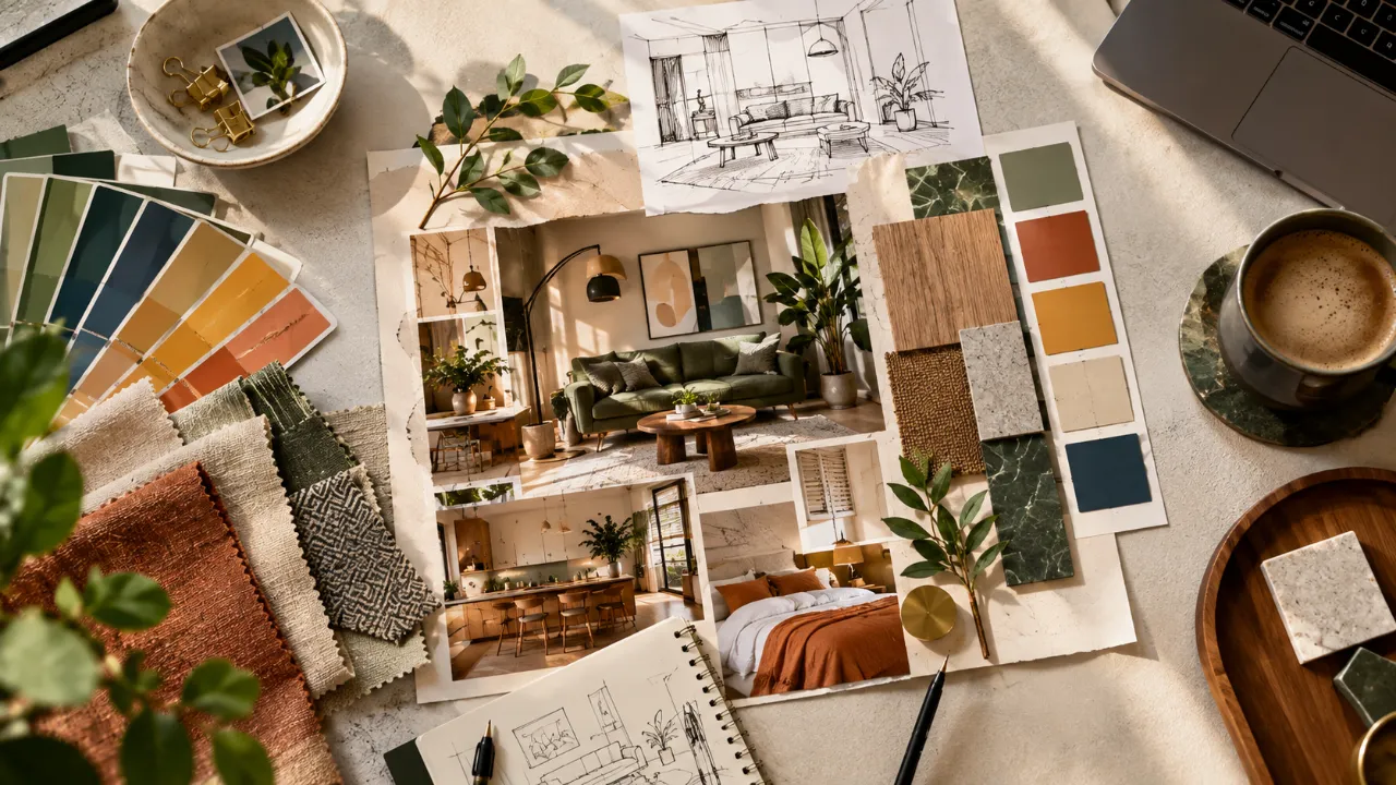
Beyond Pretty Pictures: How to Build a Mood Board Designers Can Use
Saving beautiful interiors is easy. Understanding what you actually like about those interiors—and communicating it clearly to a designer—is much harder.
That is where a good mood board becomes useful.
A mood board is not simply a collage of attractive bedrooms, kitchens or living rooms. A useful interior design mood board gives your designer clues about your preferences: the colours you respond to, the materials you like, the furniture shapes that appeal to you, the atmosphere you want and, just as importantly, the things you do not want.
When it is put together thoughtfully, a mood board can make the design conversation much more specific.
The objective is not to tell the designer exactly what to copy. It is to show them what you mean.
- What a Mood Board Is Actually Supposed to Do
- Start With the Feeling
- Choose Images for a Reason
- Group Similar Ideas Together
- Show Your Colour Preferences
- Include Materials, Not Just Colours
- Include Furniture Shapes
- Use "Like This" and "Not Like This"
- Add Your Existing Home
- Include Practical Priorities
- Separate Must-Haves From Nice-to-Haves
- Look for Patterns
- Common Mood Board Mistakes
- A Simple Mood Board Formula
- Before You Send Your Mood Board
- FAQ
What a Mood Board Is Actually Supposed to Do
A mood board should answer a simple question:
That answer can be expressed through a combination of images, colours, textures, materials, furniture, lighting and architectural references.
You might not know the name of a particular design style, but you may consistently save warm timber, soft beige walls, curved furniture, indirect lighting and textured fabrics.
Those references collectively communicate much more than simply saying, "I want a modern home."
Start With the Feeling, Not the Furniture
One of the biggest mistakes people make is beginning with individual products.
A home is rarely successful because of one piece of furniture. Start by describing the atmosphere you want.
- Calm and warm
- Refined and luxurious
- Relaxed and natural
- Contemporary and clean
- Dramatic and moody
- Colourful and energetic
- Understated and timeless
You can have several adjectives, but try to identify the feeling that matters most.
Choose Images for a Reason
Not every image needs to show an entire room. In fact, some of the most useful references are close-ups.
- A full-room image for overall composition
- A close-up of a wall finish
- A kitchen detail for cabinetry
- A fabric image for texture
- A lighting reference
- A furniture silhouette
- A flooring reference
- A colour combination
The important question is: Why am I saving this image?
Maybe you like the room because of its warm lighting—not because you want the exact furniture. Maybe you like the wardrobe because of its door detailing—not because you want the same colour.
Understanding the reason behind each reference makes the board much more useful.
Keep the Board Focused
More references do not automatically make communication better.
If your mood board contains dozens of different rooms, colours and unrelated styles, your designer may see several directions rather than one clear preference.
A smaller collection of strong references is usually easier to understand.
Look for repetition. If several images feature the same kind of wood, lighting or furniture shape, that repetition is telling you something.
Group Similar Ideas Together
A mood board becomes easier to interpret when it has structure.
How you want the room or home to feel.
Base colours, accent colours and preferred contrast.
Wood, stone, metal, glass, fabrics and finishes.
Shapes, proportions and overall design language.
Pendant styles, wall lights, ambient lighting and atmosphere.
Handles, wall treatments, artwork, rugs, curtains and styling.
Show Your Colour Preferences Clearly
Colour is one of the easiest things to misunderstand verbally.
Instead of saying "I like neutral colours," show what neutral means to you.
- Warm cream over cool white
- Taupe over grey
- Muted olive over bright green
- Dusty blue over navy
- Natural timber over dark walnut
A small colour palette can be extremely useful. Choose a few dominant colours and one or two accent tones.
Include Materials, Not Just Colours
A brown wall and a brown wood cabinet may look similar on a screen but behave very differently in a room.
That is why material references matter.
- Matte and glossy
- Smooth and textured
- Natural and engineered
- Light timber and dark timber
- Polished stone and honed stone
- Brushed metal and reflective metal
You may discover that what you actually like is not a colour at all. It may be texture.
Include Furniture Shapes
You do not have to identify a specific furniture brand or product. Instead, show forms.
- Curved sofas or straight-lined sofas
- Slim legs or heavier bases
- Rounded coffee tables or rectangular ones
- Floating cabinetry or floor-standing storage
- Open shelving or concealed storage
These details help the designer understand your preferences without locking the design into someone else's room.
Use "Like This" and "Not Like This"
One of the most helpful additions you can make to a mood board is a small section for things you do not want.
Warm timber, soft lighting, rounded forms and muted colours.
High-gloss finishes, cool grey interiors and excessive ornamentation.
This can prevent misunderstandings early in the project. A designer needs boundaries as much as inspiration.
Add Your Existing Home to the Conversation
Your mood board should not exist separately from your actual room.
If you are redesigning an existing space, include photographs of the room, flooring, windows, doors, existing furniture, architectural elements and natural light.
This gives context. A reference image may show a huge sun-filled room, while your actual space may have limited daylight and a very different layout.
That does not make the reference useless. It simply tells the designer that the reference is about atmosphere rather than exact execution.
Don't Forget Practical Priorities
A mood board usually focuses on appearance, but a designer also needs to understand how you live.
Add a short note about practical priorities such as:
- Maximum storage
- Easy cleaning
- Child-friendly materials
- Pet-friendly finishes
- Space for entertaining
- Television viewing requirements
- Work-from-home needs
- Space for collections
- Hidden appliances
- Flexible furniture
Separate Must-Haves From Nice-to-Haves
Not every idea on your mood board should have the same importance.
Elements you genuinely want and would like the design to accommodate.
Features you would like, but can adapt if the space requires another solution.
Ideas you like visually without expecting them to be reproduced exactly.
Don't Copy One Image
One of the least useful approaches is saying, "I want my home to look exactly like this."
A reference image usually contains dozens of things working together: the architecture, proportions, lighting, furniture, materials, styling and photography.
Your home will have different dimensions, natural light, circulation, requirements and budget.
Instead of copying one room, take ideas from several references. One might influence the colour palette. Another might influence the furniture language. Another might show the kind of lighting you prefer.
The resulting design can then become yours.
Look for Patterns Across Your Saved Images
Once you have collected your references, stop and analyse them.
Ask:
Maybe almost every image has warm wood. Maybe you repeatedly save rooms with very little visual clutter. Maybe curved furniture appears again and again. Maybe you prefer layered lighting instead of bright central fixtures.
Those patterns are more important than any single image.
They reveal your actual design preferences.
A Mood Board Should Explain, Not Overwhelm
A useful mood board does not need to contain every possible detail.
It should make your priorities easier to understand.
A designer should be able to look at it and quickly identify:
- The overall atmosphere
- The colour direction
- The material preferences
- The furniture language
- The lighting mood
- The important details
- The practical requirements
Digital Mood Board vs Physical Mood Board
A digital mood board is convenient because you can collect references quickly and rearrange them easily. It is particularly useful during the early inspiration stage.
A physical mood board can become more valuable when you want to compare actual samples.
Paint, fabric, veneer, stone and metal can look very different depending on lighting and surrounding materials.
For larger projects, the two approaches can work together. Begin digitally to establish the direction, then move toward actual samples when selections become more specific.
Common Mood Board Mistakes
Saving everything you like
Liking an image does not necessarily mean it belongs to your home's direction.
Mixing too many styles
A little contrast can add interest. Too many unrelated styles create confusion.
Showing only finished rooms
Close-ups of materials, lighting and details can communicate specific preferences much better.
Giving no explanation
A designer should know what you liked about a reference.
Ignoring function
A beautiful visual direction does not replace storage, circulation, comfort or maintenance requirements.
Treating the board as the final design
A mood board is a starting point for interpretation, not a construction drawing.
A Simple Mood Board Formula
2. Colour — What colours define the direction?
3. Materials — What textures and finishes appeal to you?
4. Furniture — What shapes and proportions do you prefer?
5. Lighting — What kind of atmosphere should the lighting create?
6. Priorities — What practical requirements cannot be compromised?
Once these are clear, your designer has something much more useful than a folder full of screenshots.
The Real Value of a Good Mood Board
The best mood board does not tell a designer what to copy. It gives them enough information to understand your taste.
That distinction matters.
You may not know design terminology. You may not know the name of a furniture style or the exact shade of beige you want.
You do not need to.
Your references can communicate those preferences visually.
The designer's job is then to translate that information into a space that works for your architecture, lifestyle, budget and practical needs.
Before You Send Your Mood Board to a Designer
- What feeling do I want the home to have?
- Which colours keep appearing in my references?
- What materials do I consistently like?
- What furniture shapes attract me?
- What kind of lighting appeals to me?
- What do I definitely not want?
- Which ideas are must-haves?
- Which references are only inspiration?
- What existing elements need to stay?
- What practical requirements matter most?
- Can I explain why I saved each major reference?
Turn Inspiration Into a Better Design Brief
A clear visual direction can make the early design conversation much easier. Explore Walls to Wonder's tools and designer resources to move from inspiration toward a more structured interior plan.
Final Thought
A mood board becomes valuable when it stops being a collection of attractive pictures and starts becoming a visual conversation.
Collect less. Observe more.
Look for patterns in what you save, explain why those references matter and separate inspiration from non-negotiables.
That gives your designer something much more useful to work with—and gives you a better starting point for creating a home that reflects your taste without simply copying someone else's space.
FAQ
How many images should an interior mood board have?
There is no fixed number, but the board should be focused enough that a clear design direction emerges. Too many unrelated references can make your preferences harder to interpret.
You can, especially when you strongly like a particular shape or style. However, also explain what you like about the piece so the designer can interpret the idea rather than simply copy the product.
Yes. Pinterest and other image platforms can be useful for collecting visual inspiration. The important part is explaining what each reference communicates about your preferences.
Yes. A short "not for me" section can help establish boundaries and prevent a designer from moving in a direction you already know you dislike.
That depends on the project. For a home with a consistent design language, one overall board plus smaller room-specific boards can help maintain both continuity and individual character.
Turn this idea into a plan for your home
Visualise your space, understand the likely budget, or find a professional who can bring the idea to life.