

The Light Test: How AI Builds a Better Paint Palette for Indian Homes
The warm beige that looked calm in a paint showroom can turn grey beside a north-facing window, while a pale green chosen from a phone screen may become unexpectedly yellow by late afternoon. The problem is rarely your taste. It is the room's changing light.
For Indian homes, that change can be pronounced: strong west sun, shaded balconies, tinted glass, white marble floors, warm LEDs and neighbouring buildings all alter how a colour is perceived. The useful question is not simply, “Which shade do I like?” It is, “Which palette still behaves well at 9 AM, 2 PM and after the lights come on?”
This is where an AI-assisted light test can help. It studies room photographs or a plan, estimates the direction and intensity of daylight, and compares how candidate colours may shift across the day. It does not replace a physical sample or a designer's judgement. It makes the early comparison more disciplined.
For more practical planning references, browse the WallsToWonder posts before you begin comparing designers and paint systems.
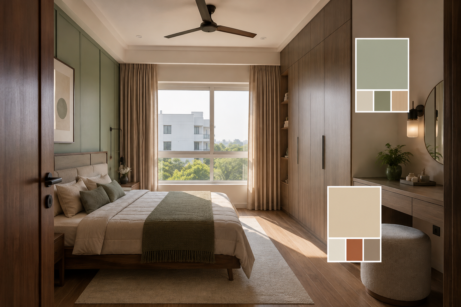
What the light test is actually reading
AI colour analysis is most useful when it separates several conditions that are often bundled together as “natural light”. A window's orientation affects the character of the light, but the room's depth, external obstruction and interior finishes affect how much of it reaches the wall.
A camera-based tool may analyse brightness gradients, window position, visible sky and surface colours. A more considered workflow can combine those observations with a floor plan, approximate room dimensions, window sizes and photographs taken at different times. The output is not a guaranteed paint result. It is a probability-based comparison: this neutral may read cleaner in indirect light; that terracotta may become too saturated near a west-facing opening.
Orientation is only the beginning
East-facing rooms tend to receive a brighter, warmer start to the day and softer light later. West-facing rooms can look comfortable in the morning yet become visually hot in the afternoon. North-facing rooms often need warmth and reflectance, while south-facing rooms may receive strong, relatively stable daylight depending on shading and season. In apartments, a nearby tower, balcony slab or deep window reveal can matter more than the compass direction.
AI can flag these tendencies, but it cannot infer every site condition from one perfectly exposed photograph. A dark image may indicate poor camera exposure rather than a dark room. A bright image may have been corrected by a phone automatically. That is why multiple observations are better than one attractive render.
How a designer turns a prediction into a usable palette
A palette is not just a wall colour. It is a relationship between walls, ceiling, trim, flooring, cabinetry, fabrics and artificial light. Designers and companies serving Indian homeowners may offer colour consultation as part of a wider service, or they may treat it as a smaller standalone decision within a renovation package.
AI-led screening
Useful for reducing a long shade list, comparing daylight conditions and spotting combinations that may become too cold, muddy or intense.
Designer review
Useful for relating colour to joinery, curtains, flooring, artwork, family preferences and the practical sequence of site work.
Physical validation
Useful for confirming the final result. Large painted samples should be viewed on more than one wall and at different times.
The best process uses all three. An AI tool can compare a soft ivory, muted sage and dusty blue faster than a person manually editing images. A designer can question whether that sage competes with the green undertone in existing vitrified tiles. A sample on the actual wall reveals what the screen cannot: texture, sheen, patchiness and the influence of nearby surfaces.
Room type changes the tolerance for colour shifts
The “perfect” palette depends on what the room must support. A bedroom may benefit from a quiet, low-contrast combination that remains restful under both daylight and warm bedside lamps. A modular kitchen usually needs enough brightness for work surfaces, but an all-white scheme can become harsh if it reflects intense sun or cool under-cabinet lighting. A home office needs controlled contrast so screens remain comfortable.
| Space or property condition | What to examine | Palette implication |
|---|---|---|
| Compact apartment room | Window depth, adjacent walls and floor reflection | Test light neutrals at large scale; a high-chroma accent can visually reduce the room. |
| Deep room with one opening | Brightness difference between the window zone and back wall | Consider a consistent mid-lightness palette rather than making the rear wall too dark. |
| Balcony-facing living room | Outdoor greenery, railing shadows and afternoon glare | Check greens, blues and warm neutrals against the view, not in isolation. |
| Renovation with existing flooring | Undertones in marble, tiles or wood-look finishes | Choose wall colours that acknowledge the floor's undertone; repainting cannot correct a material mismatch. |
Property type also affects the workflow. In a rented apartment, removable samples and restrained changes may be more sensible than a full palette overhaul. In a new-build home, the designer can coordinate paint with wardrobes, false-ceiling details and lighting before materials are ordered. An occupied renovation needs a sampling plan that does not leave every room covered in competing swatches.
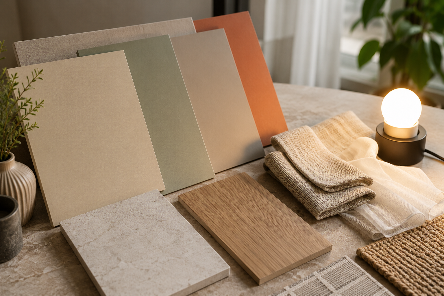
Where WallsToWonder tools fit into the comparison
Colour decisions rarely sit alone. Once a palette is shortlisted, homeowners usually need to understand whether the wider interior scope is affordable and whether a quotation describes the work clearly. WallsToWonder's tools can support those checks while you remain in control of the design decision.
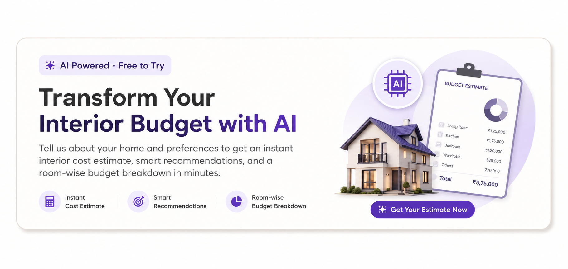
Estimate the wider scope
Use the interior design cost estimator to create an early budget view. Treat the result as a planning range: room count, carpentry, electrical changes, finishes and site conditions can all alter the eventual cost.
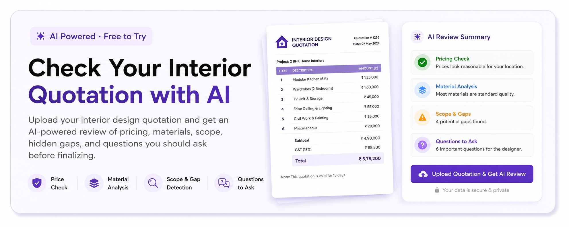
Interrogate the quotation
Before an advance, run the document through the quotation checker to identify missing descriptions or items that need clarification. It is a review aid, not a substitute for reading the contract.
Compare designers by the questions they ask
When you compare interior designers, look beyond the number of images in a portfolio. Ask whether the service includes a colour consultation, moodboards, sample approval, detailed drawings, material specifications, site coordination and final styling. Some designers may offer a complete design-and-execution service; others may provide concepts while the homeowner appoints separate contractors.
A good comparison is scope against scope. One proposal may include paint selection but exclude surface preparation. Another may include a site visit, sample boards and supervision but charge separately for revisions. Neither is automatically better. The important point is that you can see what decision-making and execution responsibility you are paying for.
Pricing factors that affect a paint-led brief
Costs can depend on the number of rooms, consultation time, site visits, the number of palette options, sample-board preparation and whether the colour work is part of a larger interior contract. Execution costs depend on wall condition, putty or repair requirements, primer, paint brand and finish, access, furniture shifting and the number of coats required.
Ask whether the quotation separates design fees from material and labour costs. Confirm the paint finish, surface preparation, brand or approved equivalent, measurement basis and treatment of touch-ups. If the palette changes after carpentry or flooring is finalised, the practical and financial consequences should be clear before work begins.
Material and quotation details that prevent colour disputes
“Off-white walls” is not a sufficient specification. A review-ready quotation should describe the intended shade or approved sample, sheen level, surface preparation, number of coats where applicable, exclusions and the process for approving a change. For textured or high-sheen finishes, the application method and substrate condition deserve particular attention because unevenness can make colour appear inconsistent.
Keep a simple approval record: the room, wall, sample reference, lighting conditions and approval date. If the designer recommends a substitute paint, ask for a fresh sample rather than assuming two products with similar names will behave identically. This is especially important when a palette is designed around subtle undertones.
Red flags before you pay an advance
- A palette is approved from a tiny digital swatch with no physical sample or site-specific discussion.
- The proposal promises a fixed visual result but says nothing about existing wall condition, daylight variation or artificial lighting.
- The quotation uses broad terms such as “premium paint” or “complete painting” without describing preparation, finish or exclusions.
- Revisions, sample approvals and site visits are discussed verbally but absent from the written scope.
- The designer discourages questions about substitutions, measurement, payment milestones or who supervises execution.
These signs do not prove poor workmanship, but they do indicate an unclear decision trail. Pause and ask for a written clarification. You can also use the quotation review tool as a second pair of eyes before committing.
Questions worth asking before the first payment
Use questions that expose the working method, not just the final moodboard:
- Will the palette be tested against my actual flooring, cabinetry, curtains and fixed lights?
- How many palette directions and revision rounds are included?
- Who purchases the paint, checks batches and records the approved shade?
- What happens if the wall needs additional repair or the sample looks different after application?
- Which parts of the work are designed, supplied, supervised or executed by others?
- Are site visits, sample boards, protection of furniture and touch-ups included in the quotation?
- What are the payment milestones, cancellation terms and process for approving variations?
Answers should be specific enough for another person to understand the agreement. If two designers give different answers, compare the service boundary before comparing the fee.
Use AI as a filter, not as the final authority
AI is valuable because it can make hidden variation visible. It can simulate how a palette might respond to a brighter window side, a shaded corridor or a warm evening lamp. It can also help a homeowner explain preferences more clearly when using Design my room or exploring possibilities through Find my style.
Its limits matter just as much. A tool may not know the exact reflectance of your tile, the quality of a phone camera, seasonal weather, dust on a window, or the way a chosen paint dries on an uneven wall. Treat generated combinations as candidates. Confirm them on site, with the actual product or a reliable physical equivalent, before ordering material.
A sensible decision trail
Save the room photographs, the AI comparisons, the physical sample images, the approved shade references and the quotation version together. Then compare designers and companies serving your area using the same brief. Explore design ideas, review available professionals in the designer directory, and return to the WallsToWonder posts for planning context.
Frequently Asked Questions
How does AI analyse natural light for paint selection?
It can study photographs, window placement, visible brightness and room surfaces to estimate how candidate colours may change through the day. The result is a comparison aid, not a guaranteed colour match.
Can AI choose the correct paint colour for an Indian home?
AI can shortlist suitable palettes, but physical samples remain essential. Orientation, balcony shade, neighbouring buildings, flooring, wall texture and warm LEDs can all change the final appearance.
Which paint colours work best in rooms with little daylight?
Light-reflective neutrals and carefully balanced warm shades often help, but the undertone matters. Test samples in the room because a beige, grey or pastel may appear unexpectedly dull or coloured in weak light.
Should I hire a designer for an AI-assisted paint palette?
A designer is useful when paint must coordinate with fixed materials, lighting, carpentry or an occupied-home renovation. For a small repaint, AI and physical sampling may be enough if the scope is simple and clearly documented.
What should a paint quotation include before I pay an advance?
Look for the approved shade or sample, finish, surface preparation, coats, labour, materials, exclusions, touch-ups, revision terms, payment milestones and variation process. Ask for unclear substitutions in writing.
Professional judgement: AI makes paint selection more thoughtful when it exposes how a room's light changes the decision. It becomes unreliable when treated as a substitute for samples, material knowledge and a clear scope of work. Use the light test to narrow the field, then let site evidence and accountable professional judgement make the final call.
Get a personalised estimate for your home
Choose your rooms, materials and preferences to understand a practical interior budget before you commit.