
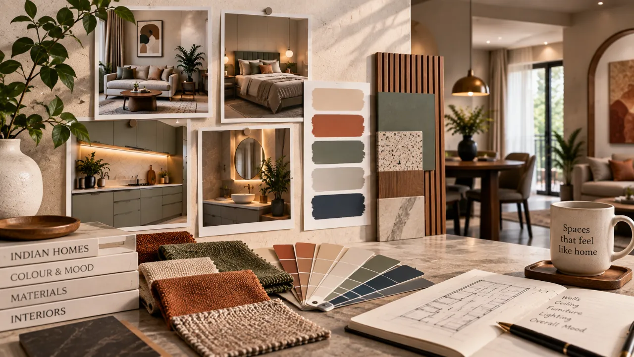
Interior Colour Combinations for Indian Homes: A Practical Design Judgement
“Keep the whole home white; colour will make it look smaller.” It is advice heard often in Indian homes, usually while a family is deciding between a warm ivory, a dusty green and the paint shade that looked perfect in a showroom. The belief contains one useful caution—dark colour can expose poor lighting—but it is too blunt for a real apartment or house.
Colour behaves differently beside teak laminate, black granite, vitrified flooring, brass hardware and the changing daylight of a monsoon-facing window. The right interior colour combination is therefore less about selecting a fashionable shade and more about judging light, surface, use and maintenance together. The WallsToWonder design ideas collection can help you build a visual shortlist before speaking to designers and companies serving your area.
Myth: one neutral shade is the safest plan for every room
A single pale beige may keep a small flat visually calm, but it can also make a north-facing bedroom feel flat or cause a white kitchen to look cold beside cool-grey flooring. Neutral does not mean colourless. Cream, greige, mushroom, sand and muted sage each change as the light moves across the room.
For a compact apartment, a warm off-white through the passage and living space can improve continuity. A bedroom may then take a low-saturation blue-grey or clay accent wall. In an independent home with larger rooms, deeper olive, terracotta or indigo can work, provided the ceiling, lighting and adjacent finishes are considered at the same time.
Myth: the shade card tells you exactly what the finished wall will look like
Paint samples are small, flat and usually viewed under shop lighting. A wall is large and receives reflected light from flooring, cabinetry and fabrics. A pale peach beside reddish wood may become noticeably warmer; a cool grey near blue upholstery can look almost blue.
Test the actual surface
Paint large sample patches on two adjacent walls, including one that receives direct daylight and one that remains shaded. Observe them in the morning, afternoon and under the proposed evening lights.
Finish changes perception
Matt paint hides minor wall irregularities and reduces glare. Higher-sheen finishes are easier to wipe but can highlight uneven plaster. Use the same sample process for laminates, tiles and wallpapers.
Myth: a matching colour scheme means every room should match
Homes need a visual relationship, not identical rooms. The kitchen has grease, steam and task lighting; a bedroom needs rest; a living room must accommodate visitors, television glare and everyday clutter. These uses should influence both the strength and placement of colour.
Keep the work zone forgiving
Warm white with muted green, charcoal or natural wood can feel balanced. Use stronger colour on shutters or a backsplash only after checking how it sits beside the countertop. Very pale surfaces need a realistic cleaning plan.
Lower the visual temperature
Dusty blue, soft olive, warm taupe and muted mauve are easier to live with than highly saturated feature walls. Check the colour beside the wardrobe laminate and the fabric chosen for curtains.
Let furniture finish the scheme
A neutral shell can carry rust cushions, a deep green chair or indigo art without repainting the room. If the sofa is already purchased, begin the palette there rather than with a trend board.
Use contrast with purpose
Full-height wardrobes can disappear into a wall-matched tone, while an open niche can take a darker backing. In narrow passages, strong contrast at every shutter may make the storage feel heavier.
For children’s rooms, washable finishes and replaceable accents often make more sense than an expensive, permanent mural. In a home office, a soft mid-tone behind the desk can reduce the starkness seen on video calls without competing with task lighting.
Myth: renovation colour choices can be made separately from the building work
During a renovation, the existing floor, window grills, doors, electrical points and dampness may remain. A palette that works in a new shell can fail when it meets old cream tiles or a dark staircase. Colour decisions should be made after the scope is mapped, not while work is already being dismantled.
The same judgement applies to resale apartments, rental upgrades and builder-finished homes. A light base with selective colour may be practical where flooring cannot be changed. In a villa or a larger independent house, the staircase, foyer and dining area may need a connecting tone so that each floor does not feel like a separate project.
What a designer should compare beyond the colour board
When comparing designers, do not compare only the prettiest rendered room. Ask what is included in the service. Depending on the company and scope, an engagement may cover concept development, measured drawings, material selection, modular kitchen and wardrobe design, lighting coordination, vendor management, installation supervision and handover support. Some services may be separate or limited, so the written proposal matters.
| Compare this | What to ask | Why it affects colour decisions |
|---|---|---|
| Design scope | Are elevations, lighting plans, paint schedules and 3D views included? | A colour can look right in a render but fail when light positions or ceiling details change. |
| Materials | Which laminate, paint, tile, edge band and hardware specifications are named? | Two similar-looking finishes can differ in sheen, cleaning needs and undertone. |
| Execution | Who measures, coordinates trades and checks installation quality? | Uneven surfaces and poorly aligned panels can undermine an otherwise sound palette. |
| Revisions | How many design changes are covered, and when are selections locked? | Late colour changes can affect procurement, timelines and the quotation. |
| Aftercare | What is documented for touch-ups, defects and replacement materials? | Future repairs are easier when paint codes and finish details are recorded. |
Look at comparable project types rather than only broad portfolios: a two-bedroom apartment, a lived-in renovation, a rental refresh and a new independent house demand different coordination. Ask to see material schedules and working drawings, not just polished images.
Two useful checks before you accept a quotation
Colour is often where a quotation becomes vague. “Premium finish,” “woodwork,” or “complete painting” does not tell you enough to compare proposals. The quotation should identify the surface, brand or approved equivalent where relevant, finish, quantity or measurement basis, hardware assumptions, installation responsibility, taxes if applicable, exclusions and payment stages.
Cost estimator
Use the interior design cost estimator to structure an early budget conversation. Treat the result as a planning aid, then confirm scope and materials with the designer.
Quotation checker
The quotation checker can help you spot missing descriptions or unclear line items before you ask specific questions.
Neither check replaces a site measurement or a contract review. Their value is in making the conversation more precise: is the colour included as paint, laminate, tile, fluted panel or wallpaper, and what happens if the selected material is unavailable?
Myth: the lowest advance means the lowest-risk designer
A small initial payment may seem reassuring, but the more important question is what happens after it. Before paying an advance, ask for a written scope, deliverables, revision terms, cancellation or refund conditions where applicable, payment milestones, material specifications, expected decision dates and the person responsible for site coordination.
- Can the designer separate design fees, manufacturing, installation and third-party work?
- Which items are provisional, and how will changes be approved?
- Who owns the drawings and material schedule if the project does not proceed?
- How are defects, delays, damaged materials and touch-ups recorded?
- Will the final colour codes, laminate references and maintenance instructions be handed over?
A professional comparison can still be warm and collaborative, but it should leave fewer assumptions. You can browse the WallsToWonder designer directory to compare designers and companies serving your project area, then request proposals using the same room list and finish expectations.
Five questions homeowners ask about colour combinations
- Which interior colour combination works best for a small Indian apartment?
- A light, warm base with one or two muted supporting colours is usually adaptable. Confirm it against flooring, daylight and furniture before deciding; size alone does not determine the palette.
- Should the ceiling always be white?
- Not always. A soft warm white can improve continuity, while a very pale version of the wall colour can make a room feel calmer. Dark ceilings need careful consideration of height and lighting.
- How many colours should a home have?
- There is no fixed number. A useful approach is to repeat a small family of base, supporting and accent tones across rooms, changing their proportion according to each room’s purpose.
- Are dark kitchen shutters impractical?
- They can show dust, fingerprints or water marks more readily depending on finish and use. Dark shutters may still work when paired with suitable hardware, lighting and a cleaning routine.
- When should colour be finalised in an interior project?
- After the measured layout and major materials are known, but before procurement and painting. Approve physical samples and record codes so later substitutions do not quietly change the scheme.
Begin with the rooms that carry the most fixed finishes—the kitchen, wardrobes and flooring—and let the softer furnishings introduce change later. For more visual references, return to the WallsToWonder design ideas library, carrying your shortlist into a designer comparison that is based on drawings, materials and clear questions rather than colour alone.
Turn this idea into a plan for your home
Visualise your space, understand the likely budget, or find a professional who can bring the idea to life.