

The Hidden Psychological Impact Of Color Palettes On Your Daily Productivity
At 10:15 on a weekday morning, the desk is tidy, the laptop is charged and the to-do list is sensible. Yet the person sitting there keeps looking towards a sharp red accent wall, feeling alert but unable to settle. Across the corridor, a softer room feels calmer, although its owner is struggling to stay awake. The difference may not be the furniture. It may be the palette.
Colour is not a productivity switch, and no shade can guarantee concentration. Light, noise, temperature, sleep and the kind of work being done all matter. Still, colour affects the visual atmosphere we spend hours inside. It can change perceived energy, visual comfort and the emotional reading of a room. That makes palette planning worth discussing when Indian homeowners compare interior designers for a new flat, a renovation or a work-from-home setup.
This guide explains how to use colour thoughtfully, how to assess a designer’s proposal beyond a mood board, and how materials and quotation details can determine whether the intended feeling survives execution. For more practical planning references, browse the WallsToWonder posts and explore organised interior design ideas.
Why colour can influence the way a room works
Our eyes process colour before we read most details in a space. A strong contrast can draw attention; a low-contrast scheme can make a room feel quieter. Warm hues may feel visually active, while cooler and muted colours are often read as more restful. These are tendencies, not rules. A pale blue room with harsh tube lighting can feel clinical, while a warm neutral room with cluttered open shelving can still feel distracting.
Productivity also has different meanings. A child doing homework, a parent attending video meetings, someone preparing meals and a person reviewing spreadsheets do not need the same visual conditions. The best palette supports the task without making the room one-dimensional.
Start with the actual Indian home, not a colour trend
A palette behaves differently in a compact apartment, a large independent house or a rented home where civil changes are limited. Many Indian households also need one room to perform several jobs: the dining table becomes a study desk, the guest room becomes a workroom and the living room must accommodate family time, visitors and television viewing.
Natural light is another major variable. A west-facing room may receive strong afternoon sun, while a shaded bedroom or a flat blocked by neighbouring buildings can rely heavily on artificial lighting. Tile floors, glossy laminates, marble, glass, curtains and wood-look finishes all reflect or absorb colour differently. A shade that looks balanced on a phone screen may appear much brighter beside a warm-white ceiling light.
Family requirements should be part of the first conversation with designers and companies serving your area. Ask them to map where work, study, rest, prayer, storage and social activity happen before selecting paint or laminates. A palette that works in a showroom may fail when school bags, chargers, lunch boxes and daily storage enter the picture.
A practical palette guide for productivity zones
| Palette direction | May support | Watch for | Where to test it |
|---|---|---|---|
| Soft off-whites and warm neutrals | Visual quiet, flexibility and a sense of space | Can feel flat if every surface has the same tone | Small home offices, shared living areas and low-light rooms |
| Muted greens and blue-greens | A calmer backdrop for reading or extended screen work | May look dull or grey under cool lighting | Study corners, bedrooms and reading areas |
| Terracotta, ochre and other restrained warm accents | Energy, warmth and visual orientation | Too much saturation can become tiring | One wall, upholstery, artwork or a niche |
| Deep tones used in small doses | Focus, definition and a stronger sense of enclosure | Can reduce perceived brightness in compact rooms | Joinery backing, a study wall or a foyer detail |
| High-contrast combinations | Clear zoning and visual emphasis | Can create glare or visual noise near screens | Circulation areas and selected architectural details |
Use samples at different times of day. Paint a large removable board or place laminate and fabric swatches side by side rather than judging a two-centimetre chip. Check the palette with the actual flooring, curtains and task lighting. If several family members use the room, invite them into this test; personal associations with colour are real design inputs even when they cannot be measured precisely.
How to compare interior designers on colour planning
Commercial investigation is not only about finding the lowest quote. You are comparing a process: interpretation of your brief, drawings, material selection, coordination and the ability to deliver the specified result. A designer may be excellent at colour but weak at site management, or highly organised with execution but less comfortable with a complex multi-use room.
- Review relevant work. Look for homes with similar light conditions, room sizes and family needs. A dramatic luxury project is not proof that the designer can plan a practical two-bedroom apartment.
- Ask for the reasoning. Request a simple explanation of the dominant, secondary and accent colours, plus what happens if you want less saturation or more daylight reflection.
- Clarify the design-to-site handover. Find out who checks wall preparation, electrical points, joinery dimensions, paint samples and final touch-ups.
- Compare what is included. Separate concept design, 3D views, drawings, sourcing, project management, installation and post-installation corrections.
- Check communication. Agree on approval stages, revision limits, site meeting frequency and the person authorised to answer execution questions.
A useful designer will also explain when a colour should be applied to a wall, laminate, glass, fabric or accessory. Those choices affect maintenance, reflectance, replacement and cost. A dark matte laminate on frequently touched shutters, for instance, may show fingerprints differently from a textured or lighter finish.
Services that shape the final palette
Colour consultation is rarely a standalone paint decision. Depending on the project, interior designers and companies serving the area may offer space planning, concept development, 2D drawings, 3D visualisation, false-ceiling planning, lighting layouts, modular kitchen and wardrobe design, material sourcing, custom furniture, vendor coordination and installation supervision.
Ask which service controls which decision. A lighting plan should be settled before you approve a palette because colour temperature changes the appearance of walls and finishes. Similarly, a kitchen palette needs to account for cabinet shutters, countertop, backsplash, appliances, handles and cleaning patterns rather than treating “white kitchen” as one specification.
For a renovation, include existing elements that will remain: flooring, window frames, doors, bathroom tiles and built-in storage. Replacing only the paint may expose a mismatch that was not visible in the original room. Good site coordination means documenting these constraints before the design is priced.
Pricing: what changes the cost of a colour-led interior?
Colour itself is usually only one part of the budget. Cost can vary with the number of rooms, wall preparation, surface area, paint system, texture or panelling, the amount of custom joinery, hardware, lighting, upholstery, artwork, labour, access and the extent of project management. A palette requiring a broad range of laminates or custom-painted finishes may involve more sampling and procurement than a simple paint refresh.
Do not compare two totals until the scope is aligned. One proposal may include only modular furniture and basic painting; another may include electrical work, ceiling details, loose furniture, curtains, delivery, installation and supervision. Use the interior design cost estimator as an early planning aid, then confirm the assumptions with each designer. It cannot replace a site measurement or a final material schedule.
Read the quotation like a specification
A quotation should make the visual promise auditable. Look for room-wise quantities, dimensions, product or finish descriptions, thickness where relevant, hardware specifications, paint preparation, electrical scope, delivery, installation, taxes if applicable, exclusions, payment stages, expected timelines and the process for approved changes.
“Premium finish”, “designer laminate” or “as discussed” is not enough on its own. Ask for the manufacturer or product reference where available, the exact shade or finish code, edge treatment, internal carcass material, soft-close hardware and the number of coats or preparation steps included. If a substitute becomes necessary, the approval method should be written down before procurement.
Use WallsToWonder’s quotation checker to organise questions and spot areas that need clarification. Treat its output as a review aid, not as a legal or technical certification. You should still have the designer revise ambiguous items in the quotation itself.
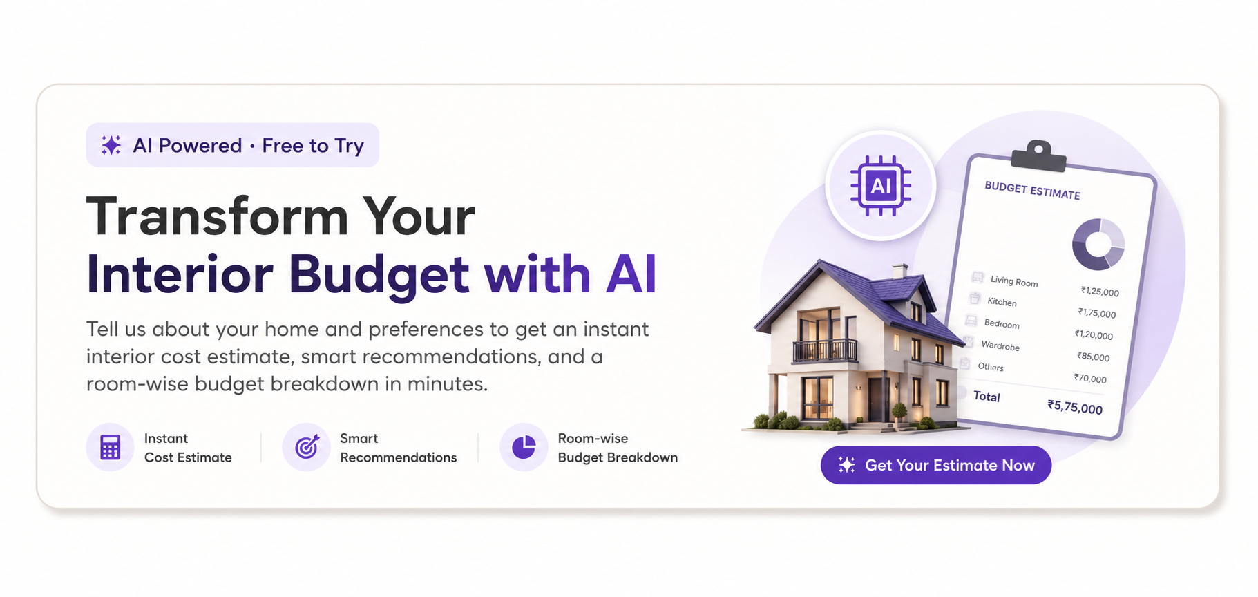
Plan the budget before the palette expands
Use the AI interior design cost estimator to structure an initial scope, identify budget-sensitive choices and prepare better conversations with designers.
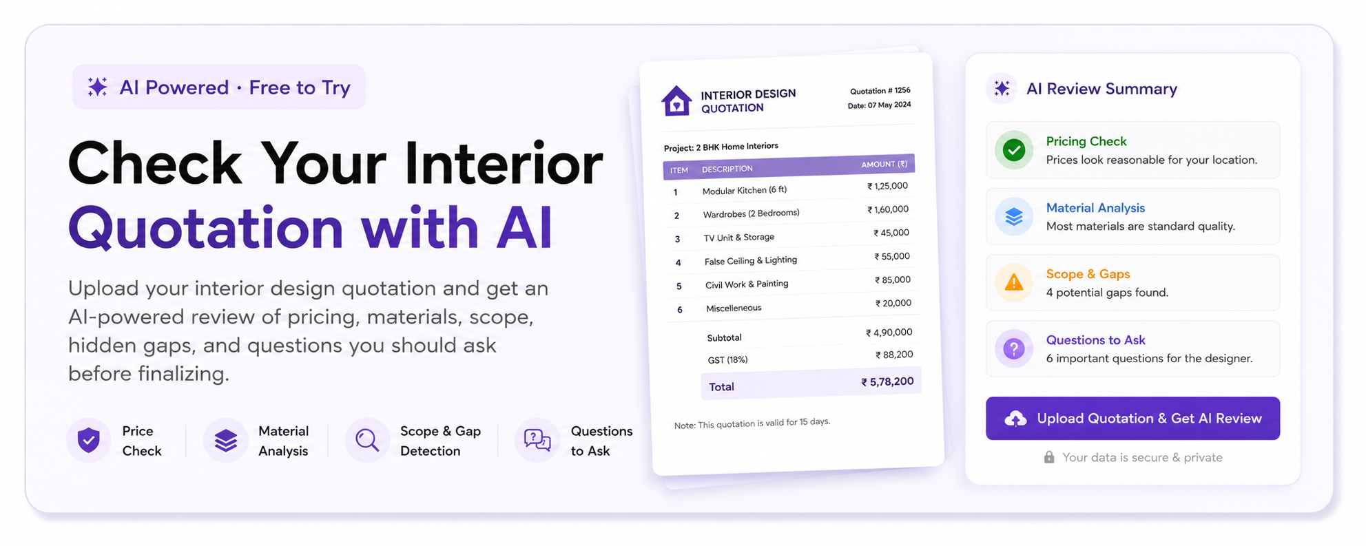
Check the details before paying
Review an interior quotation with the AI quotation checker, then ask the company to resolve exclusions, substitutions and payment-stage questions in writing.
Red flags before you pay an advance
- A palette is presented as a guaranteed cure for distraction, stress or poor concentration.
- The proposal uses attractive renders but does not show dimensions, lighting assumptions or finish references.
- The quotation has a large advance but no clear milestone, deliverable, cancellation or change process.
- Material samples are unavailable, substitutions are unrestricted, or the person approving finishes is not identified.
- The designer dismisses practical concerns such as cleaning, glare, children’s use, ageing surfaces or colour variation between batches.
- Site measurements and existing-condition photographs are skipped even though the project includes renovation or custom joinery.
Before transferring money, ask who owns the drawings, how revisions are handled, what happens if a selected product is unavailable, who is responsible for damaged material, and how defects are recorded after installation. Also ask for references or completed-work conversations where the designer can share them legitimately; do not rely on uncheckable claims.
Use WallsToWonder to narrow the search
Start with a brief that records the room’s orientation, approximate dimensions, existing finishes, users, working hours, storage needs, preferred colours and colours you dislike. Add photographs taken in morning and evening light. Then use Find my style to put words around your preferences, or try Design my room to explore directions before requesting detailed proposals.
If you are unsure how to frame a question about lighting, materials or a multi-use room, the AI interior assistant can help you create a discussion checklist. For human-led discovery, compare portfolios and service information in the WallsToWonder designer directory. Treat every profile as a starting point for due diligence: compare scope, communication and quotation quality before making a selection.
Make the palette decision measurable
Save three large samples, test them with your planned lighting and list what each designer has included. Revisit the shortlist after a day rather than approving a colour immediately after a polished presentation. When you are ready, use WallsToWonder to explore designers and companies serving your area, organise your brief and ask sharper questions before the advance.
Frequently Asked Questions
Which colour is best for productivity in a home office?
There is no universally best colour. Soft neutrals, muted greens and restrained blue-green tones can provide a calm backdrop, while a controlled warm accent may add energy. Test the shade with your actual daylight, task lighting and screen position.
Do bright colours improve concentration?
Bright colours can increase visual stimulation, but they may also feel tiring or distracting when used across large surfaces. Consider them for a small accent, storage niche or accessory rather than assuming more saturation means more focus.
How should I compare interior designers for a colour-focused project?
Compare relevant portfolios, explanation of the palette, drawings, lighting coordination, material schedules, site supervision, inclusions, revision rules and quotation clarity. Do not compare headline prices without matching the scope.
What should an interior quotation mention about colours and finishes?
It should identify rooms, surfaces, finish or product references where available, quantities, preparation, application, edge details, hardware, exclusions, substitutions, installation and approval stages. Vague terms such as “premium finish” need clarification.
Can an AI tool choose the right productivity colour palette?
AI tools can help you explore styles, organise a budget and prepare questions, but they cannot fully judge your home’s changing daylight, material samples, family routines or site conditions. Use their suggestions as preparation for a designer-led review.